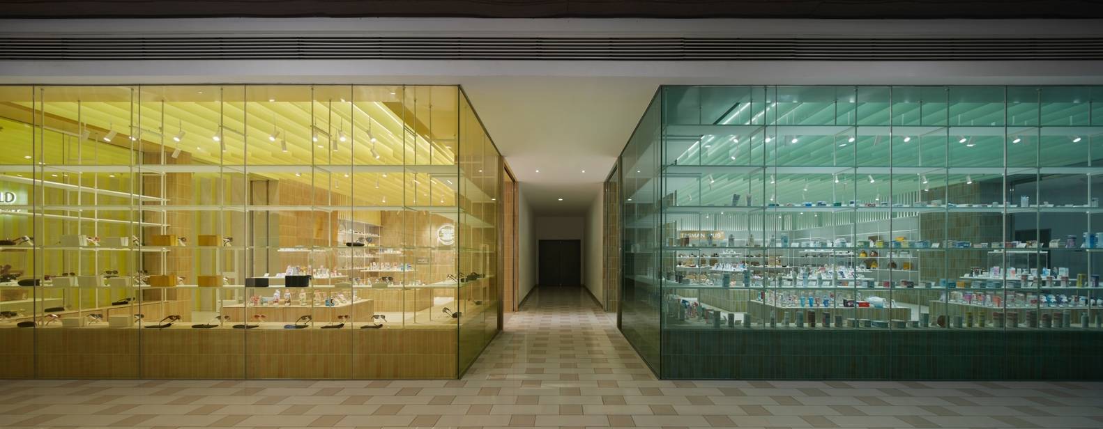
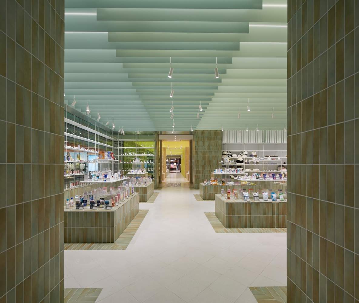
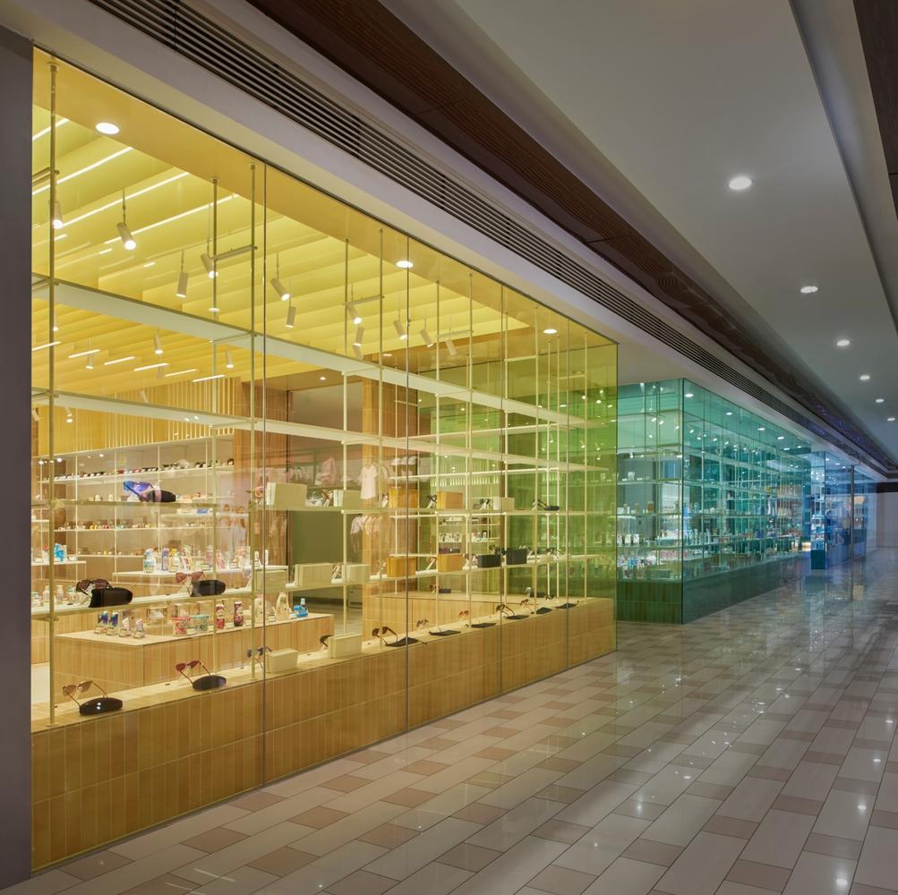
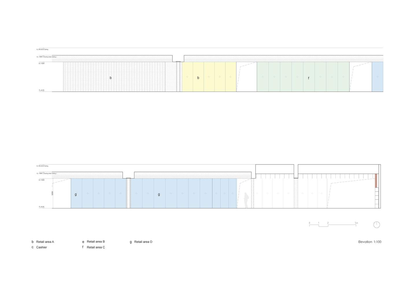
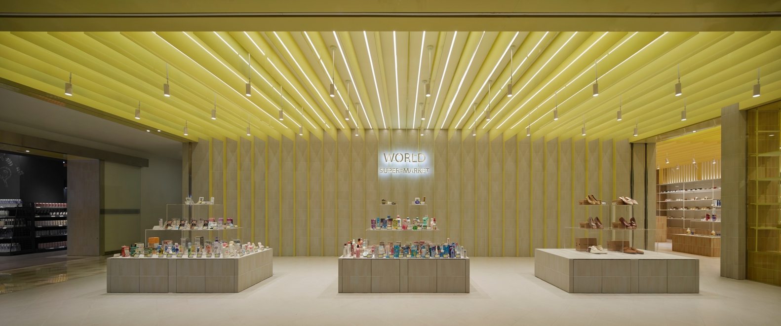
色彩图谱驱动的叙事性空间序列:该项目最精髓之处在于将“色彩图谱”作为核心设计母题,成功地将商业流线转化为一场流动的色彩叙事。通过巧妙地将原有 2 米的“断裂”空间转化为色彩过渡的媒介,设计师实现了从起始的黄色基调,渐变至绿色、蓝色的连贯序列。这种处理不仅赋予了每个陈列区独特的身份,更保证了整体“同一店铺”的视觉统一性。色彩线索成为强有力的组织元素,清晰地界定了功能区域,使消费者在浏览商品的同时,获得有节奏感的、易于识别的感官体验。
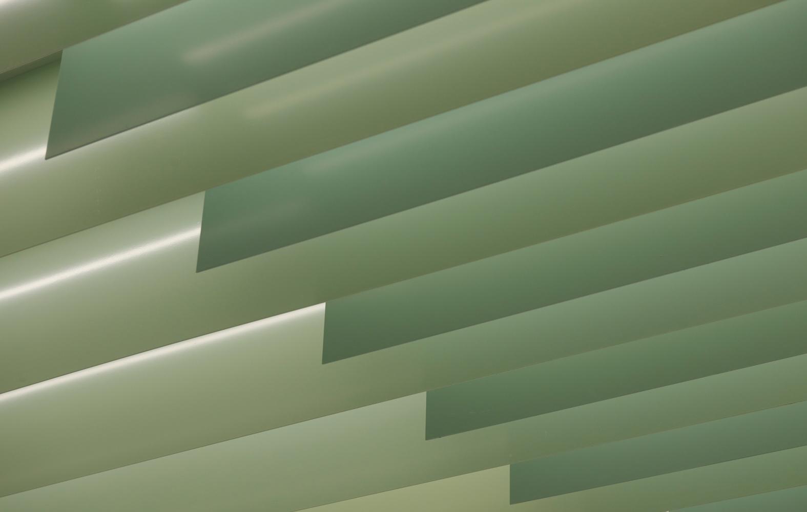
材质的克制与细腻的触感层次:建筑师在材质选择上展现了高度的专业克制,聚焦于铝板、小块瓷砖和玻璃等日常材料。项目的亮点在于对这些基础材料的比例、组合和色彩的精细控制,从而创造出细腻的触感和丰富的层次感。通过统一的天花、墙面、地面和陈列道具的系统逻辑,设计师使色彩能够在不同材质界面间如“水彩晕染”般自然流淌,实现了饱和度的适度收敛。这种手法在有限的空间内,极大地提升了空间的质感和呼吸感,避免了过度装饰带来的杂乱。
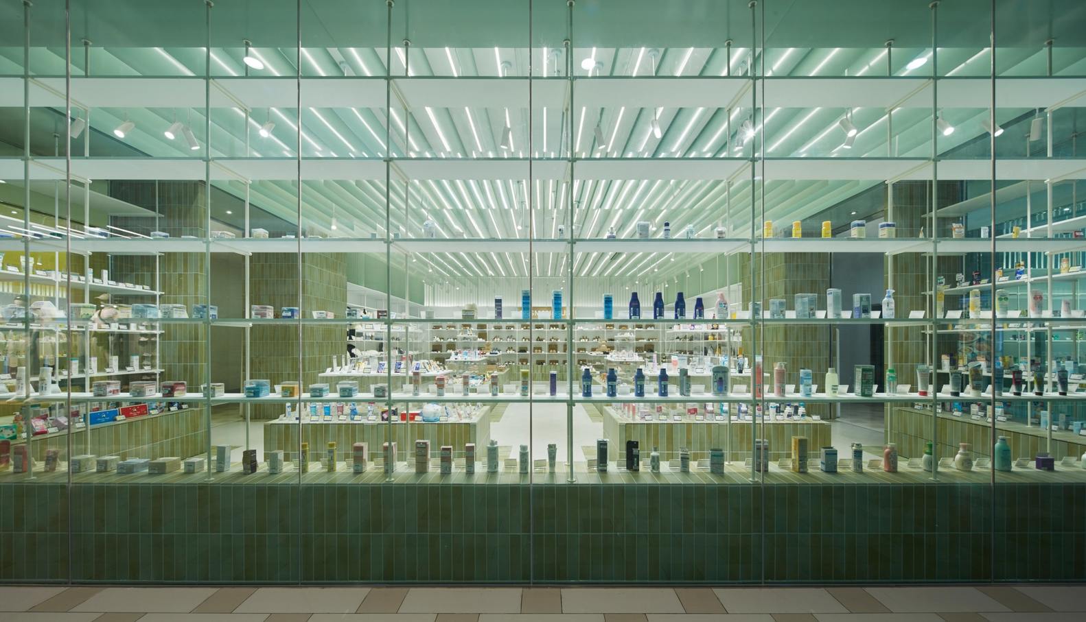
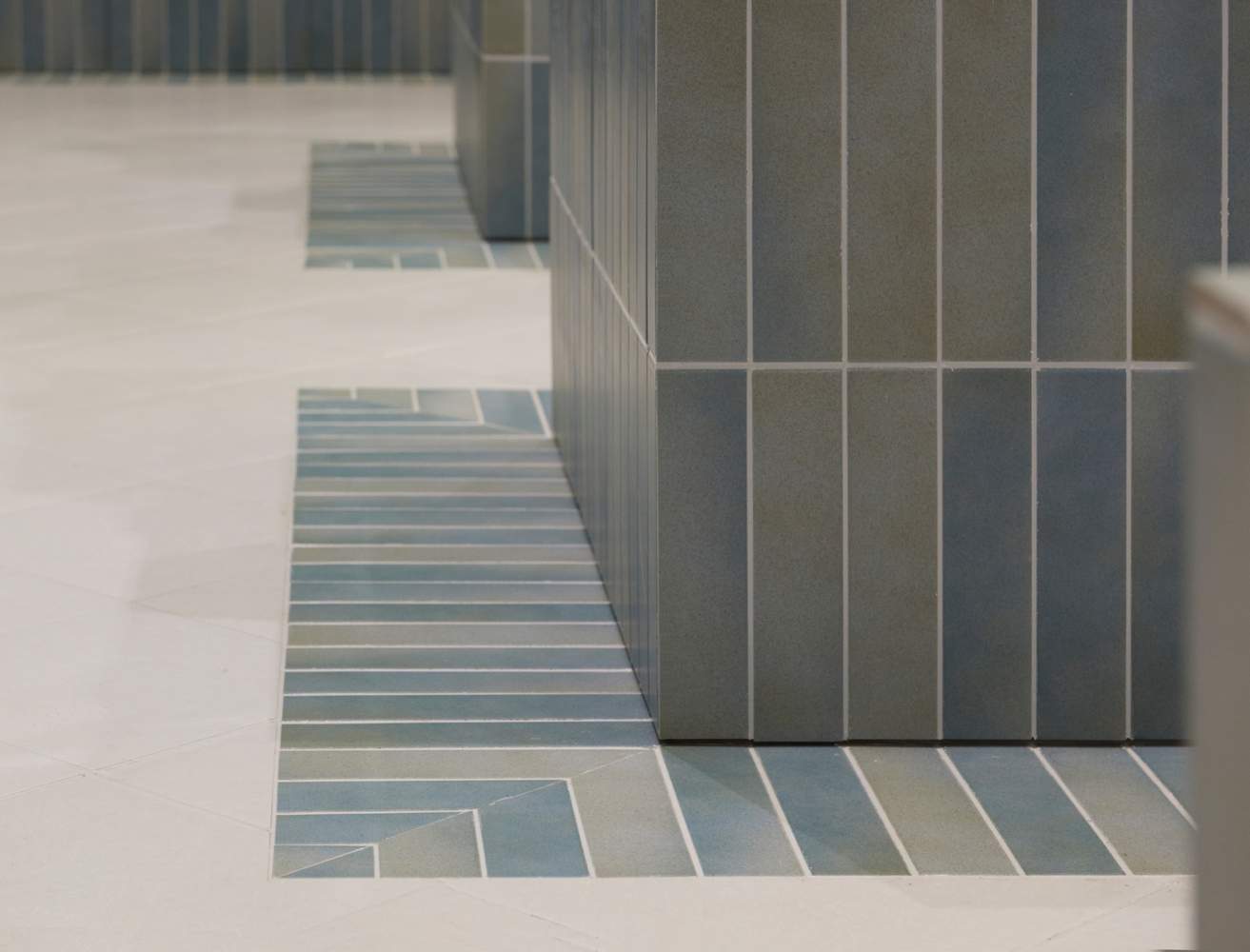
结构化细节与空间秩序的平衡:该设计在宏观的色彩序列之下,隐藏着严谨的结构化细节处理。例如,通过两种灰度的同色铝板在纵深方向的叠加,来回应地面砖的区域划分和通道开口,这体现了对空间节奏和对称性的精准把握。墙面和核心装置的小块瓷砖铺设,以及利用白色收束高处视野的设计,成功地柔和连接了不同的色区,并提供了视觉上的平衡感。这种从宏观的色彩逻辑到微观的材料节点处理的层层递进,共同编织了一套清晰、流动且富有力量感的商业空间秩序。
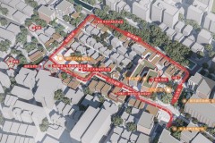
From the Architect. World Super Market is located on the B1 floor of the Suzhou M&C Mall New District store, composed of continuous retail units. The owner has concentrated the resources of multi-national brands under their "M&C Boundaryless Luxury" here, creating a commercial scene that combines a global vision with everyday warmth. Kiki Architectural Design Studio's principal architect, Jia-Yan Guan, drew inspiration from a "color atlas," transforming colors and textures into a visual rhythm that weaves the space, unfolding a narrative of materials and colors through flowing color clues.
来自建筑师。World Super Market 位于苏州美罗百货新区店地下一层,由连续铺位构成。业主将旗下“美罗无界小奢”的多国品牌资源在此集中呈现,营造兼具全球视野与日常温度的商业场景。KiKi 建筑设计事务所主持建筑师关佳彦以“色彩图谱”为灵感,将色彩与肌理化为编织空间的视觉韵律,以流动的色彩线索展开一场关于材质与色彩的叙事。
© 锐景摄影
© 锐景摄影
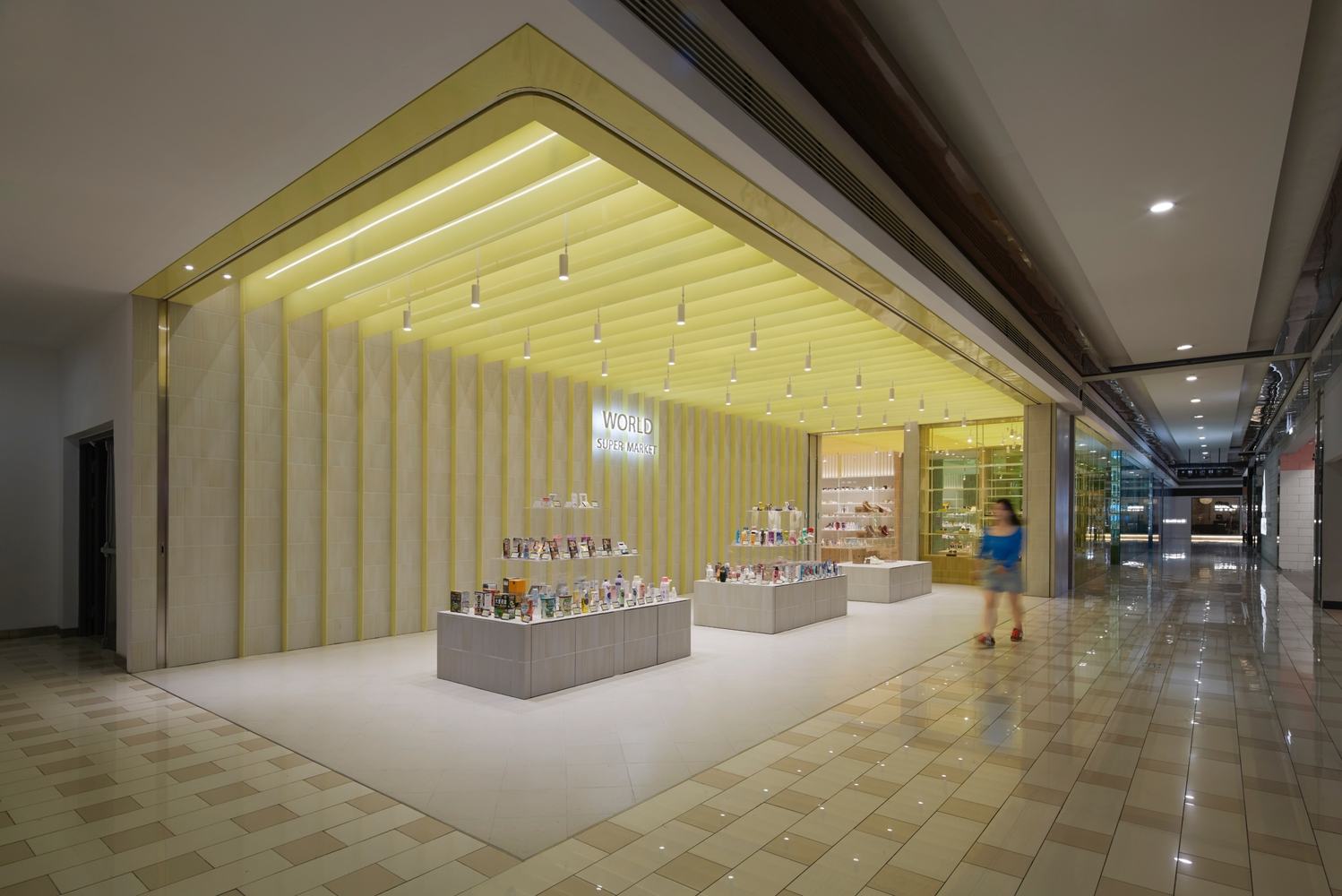
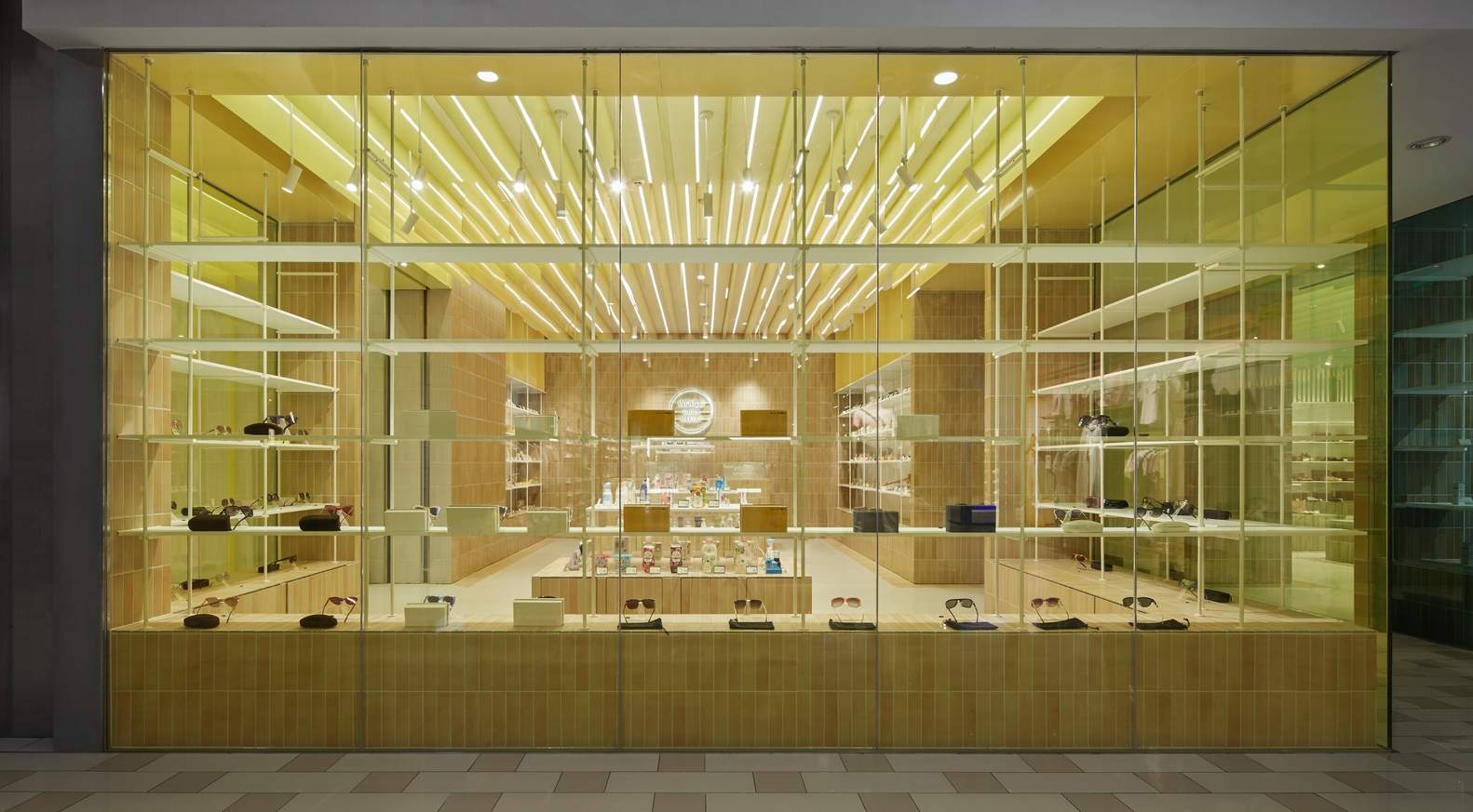
On the left side of the project entrance is the original supermarket, featuring a warm yellow tone. The designer continued this familiar visual memory by setting the main entrance display area in yellow, allowing for a natural transition in the space. The existing pathway separated the units by nearly 2 meters; this "discontinuity" was transformed into spatial rhythm. Using the partition as a medium, the design transitions gradually along the color atlas from yellow to green and then to blue, giving different display areas independent yet connected main color themes and forming clear visual axes. The easily recognizable colors flow outward, simultaneously revealing the coherence of the "single store" and the diversity of "different products."
项目入口左侧是原有超市,带有温暖的黄色基调。设计师延续这份熟悉的视觉记忆,将主入口陈列区设为黄色,使空间自然衔接。原有通道将铺位分隔出近 2 米距离,这一“断裂”被转化为空间节奏。以隔断为媒介,设计沿色彩图谱从黄色渐次过渡至绿色、蓝色,使不同陈列区拥有独立且连贯的主色调,并形成清晰的视觉轴线。易识别的色彩从内部向外流动,让“同一店铺”的整体性与“不同产品”的差异性同时显现。
© 锐景摄影
© 锐景摄影
© 锐景摄影
© 锐景摄影
© 锐景摄影
© 锐景摄影
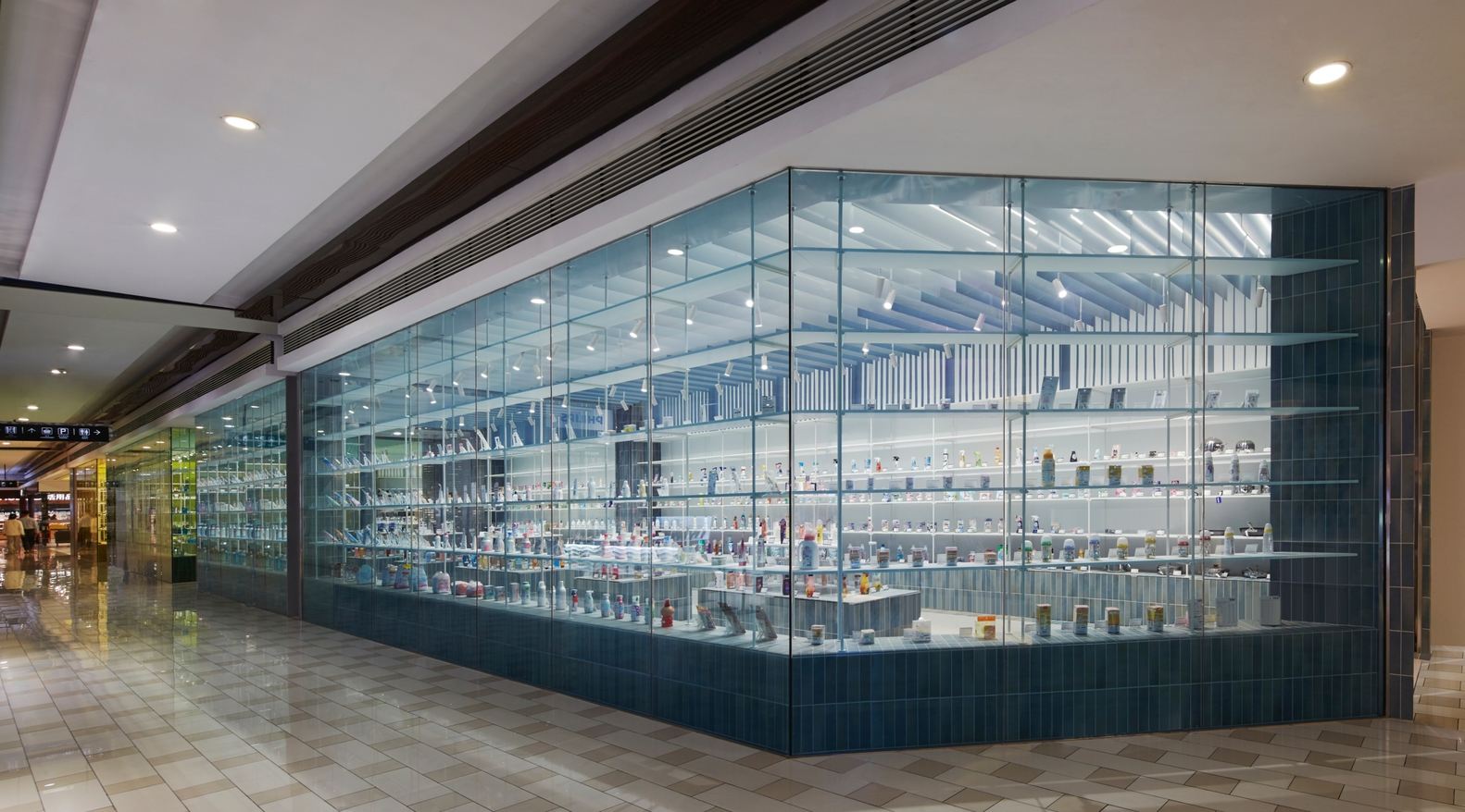
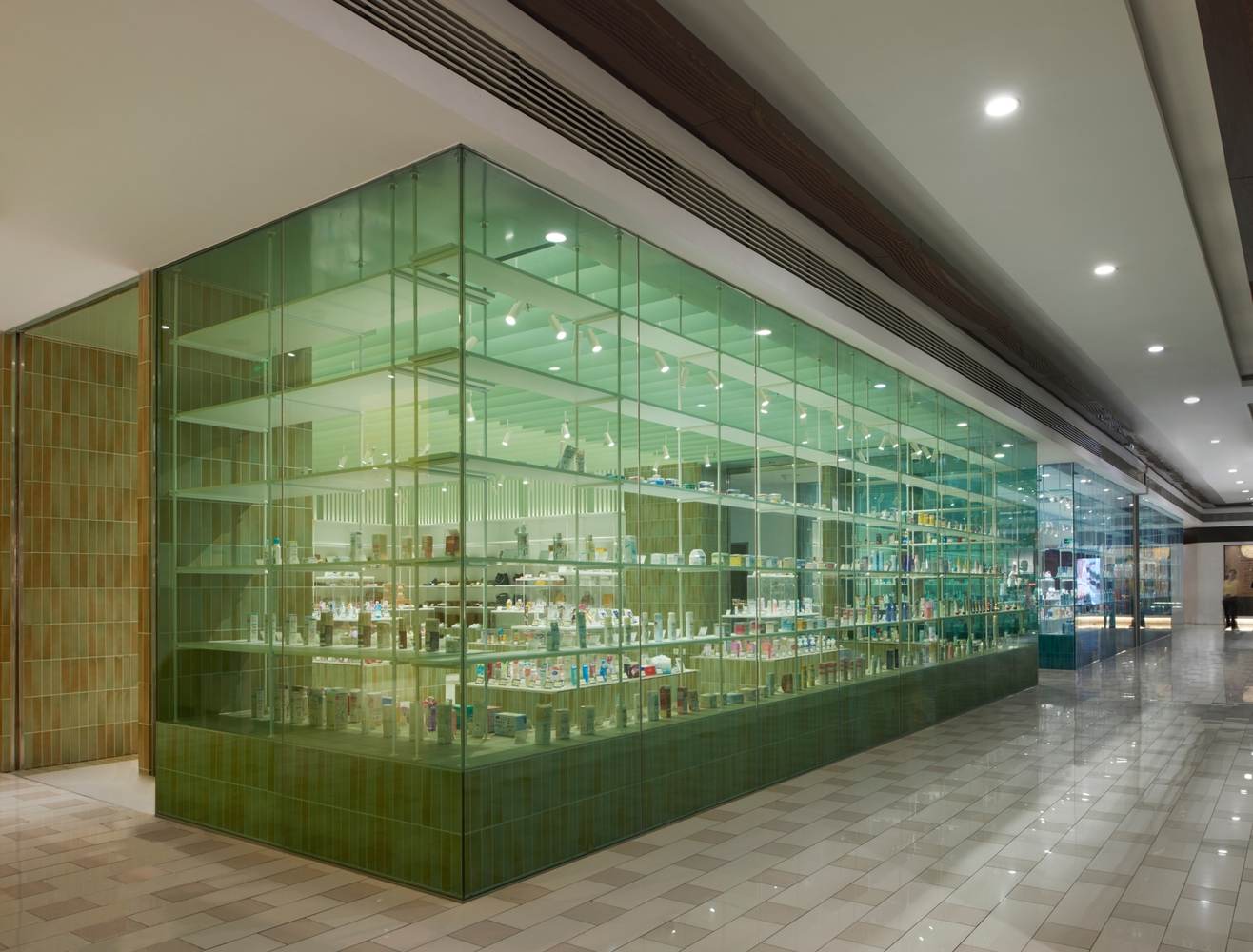
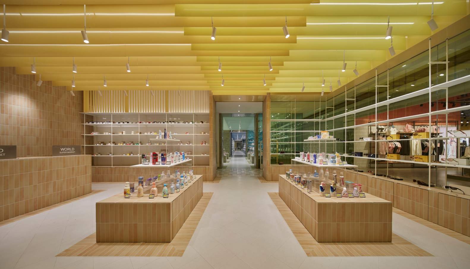
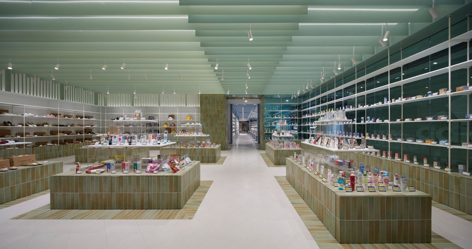
The selection of spatial materials is restrained and simple, including aluminum panels on the ceiling, small square tiles, and curtain wall glass. Everyday materials, controlled by proportion and combination, present a delicate touch and layered quality. The four major elements—ceiling, walls, floor, and display props—follow a unified systematic logic and are assigned their respective colors. Due to the narrow spacing of only 2 meters between display sections, the color transition is treated like watercolor bleeding—with appropriately restrained saturation, allowing the tones to flow naturally between different materials and surfaces, forming a breathing, layered effect.
空间材质选择克制而简洁,包括天花铝板、小块瓷砖与幕墙玻璃等。日常材料经比例与组合控制,呈现细腻触感与层次。天花、墙面、地面与陈列道具四大元素遵循统一的系统逻辑,并赋予各自色彩。由于陈列区间距仅 2 米、串联排布,色彩过渡被处理得如水彩晕染 —— 饱和度适度收敛,使色调在不同材质与界面间自然流淌,形成呼吸般的层次。
© 锐景摄影
© 锐景摄影
The spatial details progress layer by layer. Aluminum panels of two different gray scales are superimposed in the depth direction, corresponding to the original colored tile areas on the floor and the openings of the passageways, creating rhythm and symmetry. Walls and core display installations use small square tiles, with tones echoing the main color of the section; the connection to the floor is achieved through material continuity and transition, bringing out a sense of envelopment and a texture of light and shadow. Display racks and the upper parts of props are finished in white, softly connecting the different color zones and providing balance within each color system.
空间细节层层递进。两种灰度的同色铝板在纵深方向叠加,对应地面原色砖区域与通道开口,营造节奏与对称。墙面与核心陈列装置采用小块瓷砖铺设,色调呼应区块主色;与地面的衔接以材质的连续与转折带出包裹感与光影质感。墙体展架与道具高处以白色收束,使不同色区被柔和连接,也为色系内部提供平衡。
© 锐景摄影
© 锐景摄影
World Super Market presents abundance within restraint: from the transition of colors to the connection of materials, from visual axes to layered displays, walking through it, people not only browse goods but also experience a meticulously woven sensory order—clear, fluid, soft, yet powerful.
World Super Market 在克制中呈现丰盈:从色彩过渡到材质衔接,从视觉轴线到层级陈列,行走其间,人们不仅浏览商品,更体验一套被精心编织的感官秩序 —— 清晰、流动、柔和而富有力量。
© 锐景摄影