常宅/2BOOKS设计
The Chang Residence / 2BOOKS design
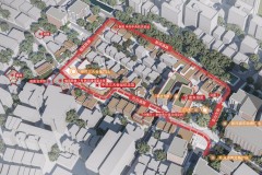
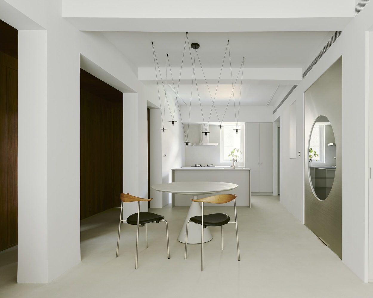
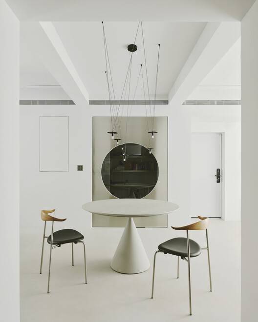
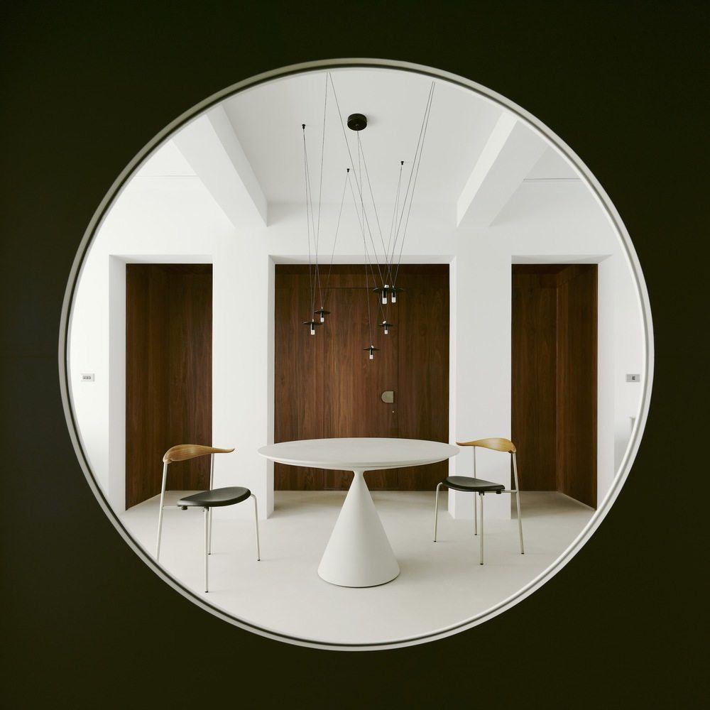
独特的空间设计:常宅项目位于台北市中心,设计师巧妙利用其 76 平方米的方形结构,打造出对称布局,营造出秩序感与开放性。拆除不必要的墙壁,开放公共区域,以胡桃木墙隐藏卧室和浴室,既保证了自然采光又维护了隐私。中央区域的不锈钢门叶散射光线,使空间明亮。整体布局体现了对空间的精心规划和对功能的精准把握。
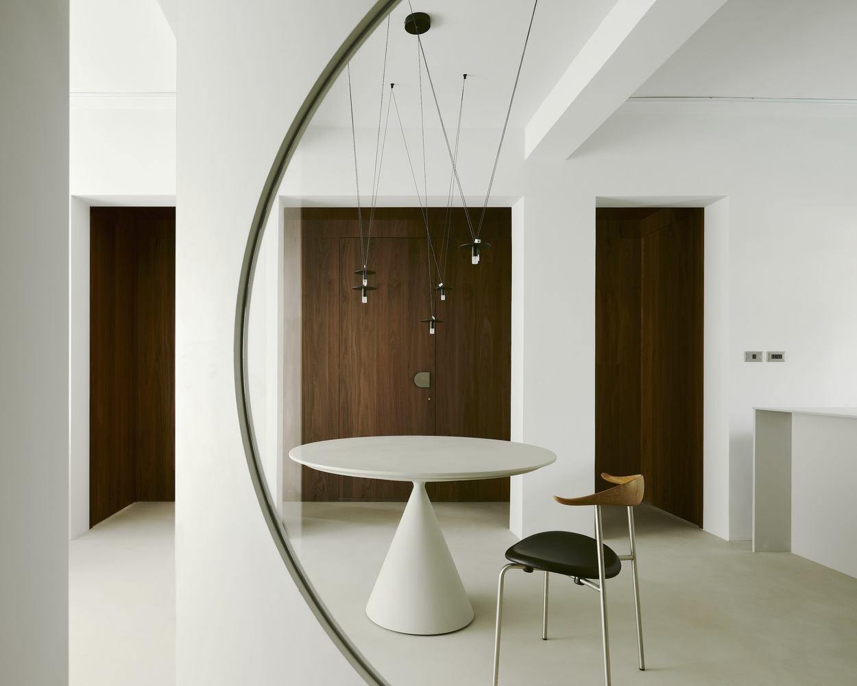
对称之美与优雅秩序:该项目在设计中有三个关于对称性的考虑,重新组织平面布局,强调空间结构透明度,利用方形特征促进对称布局,使公共区域开放畅通。同时,参考中庭设计处理承重柱,突出以用餐区为中心的对称特征。整体项目充满简洁优雅,灰色背景搭配不同材质,突出结构特征。书房的不锈钢旋转门与卧室走廊的胡桃木饰面等设计,既体现了功能性,又增添了优雅秩序。
© Studio Millspace
© Studio Millspace
建筑师提供的文字描述Text description provided by the architects. The Chang Residence is located in a residential area in central Taipei. Although its interior area was only 76 square meters, its square structure was used to create a symmetrical layout, allowing us to evoke a sense of orderliness and openness. In terms of spatial distribution, the design opens up the entire public area, replacing partitions with exposed structural beams and columns, allowing for fluid distinctions between the living area, restaurant, and kitchen. Hidden behind a walnut wall is the bedroom and bathroom. We aimed to maximize natural lighting while maintaining privacy. Moreover, the directions of partition walls were adjusted to minimize the obstruction of natural light. The central area of the interior, where natural light is weakest, features stainless steel door leaves that help scatter light from the front and back windows, keeping the space bright.
© Studio Millspace
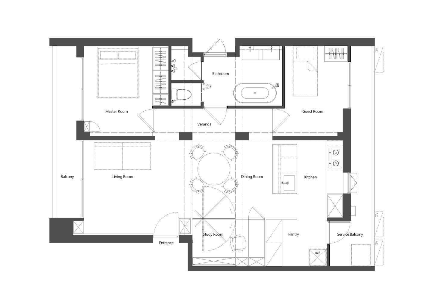
Plan
在现代城市丛林中,每一平方英寸的空间使用都是经过深思熟虑的结果,但我们都试图在复杂的蜂巢式城市场景中插入一个舒适而私密的休息场所。该项目位于台北市中心的一个高端住宅区。这对业主夫妇喜欢简单的住宅,希望在生活中享受一种开放的感觉。为了回应他们对简洁和回归原始功能的期望,我们重新组织了空间结构,整合了公共区域的墙壁,并开放了起居空间、餐厅和厨房,营造出明亮开放的外观。
In the modern city urban jungle, every square inch of space usage is the result of a committed calculation, yet we all seek to insert a comfortable and private resting place within the complex beehive-like urban scene. The project is located in a high-end residential area in the heart of Taipei City. The owner couple was in favor of a simple plan dwelling and hoped to enjoy an open feeling in their lives. In response to their expectations of simplicity and return to the original functionality, we reorganized the spatial structure, integrated the walls of the public areas and opened up the living space, dining room and kitchen to create a bright and open appearance.
© Studio Millspace
© Studio Millspace
© Studio Millspace
关于对称性——我们指出,总体规划中有三个考虑因素:第一,建筑正面靠近其他建筑,背面是相邻建筑的背面,因此这两个方向都不适合自然采光。因此,通过重新组织内部平面布局作为起点,拆除不再需要的墙壁并重新组织旧的公用设施线路,整体布局现在允许前后照明渗透到家中。此外,建筑占地面积是一个相当对称的方形,但楼层高度较低,横梁较深,因此悬浮天花板平面以避免低压迫感非常重要。该设计强调空间结构的透明度,以提供整洁开放的视觉体验。并利用室内结构的方形特征来促进“对称”布局。这使得公共区域尽可能开放,以保持视线和流通的畅通。
About Symmetry - We pointed out that there were three considerations in the overall planning: first, the building front is in close proximity to other buildings, and the rear side is the back of the adjacent buildings so both orientations were not ideal for natural lighting. Therefore, by reorganizing the internal plan layout as a starting point, removing no longer needed walls and reorganizing old utility lines, the overall layout now allows front and rear lighting to penetrate into the home. Additionally, the building footprint is a fairly symmetrical square shape, but with a low floor-to-floor height and deep beams, so it was important to levitate the ceiling plane to avoid the low oppressive feeling, The design emphasizes the sense of transparency of space construction to offer a neat and open visual experience. and uses the square characteristics of the interior structure to promote a "symmetrical" layout. This made the public area as open as possible to maintain the smooth flow of sight and circulation.
© Studio Millspace
© Studio Millspace
第三,私人和公共区域之间有两个现有的承重柱,如何保持畅通的流通是另一个设计重点。我们参考了中庭设计,通过添加一个带有透明走廊的过渡区和暴露的天花板来减少视觉压迫,使走廊的柱子延伸到卧室区域。它还将现有的结构元素变成了一个框架,形成了一个对称的界限。这突出了以用餐区为中心的对称特征,为室内营造了整洁、有序、开放、明亮的视觉体验。
Thirdly, there are two existing load-bearing columns situated between the private and the public areas, and how to maintain a smooth circulation flow was another design focus. We referenced the atrium design to feature the columns of the corridor that extend into the bedroom area by adding a transitional zone with a transparent corridor and the exposed ceiling to lessen the visual oppression. It also turned the existing structural elements into a frame to form a symmetrical demarcation. This highlights the symmetrical characteristics centered on the dining area and constructs a neat, orderly, open and bright visual experience for the interior.
© Studio Millspace
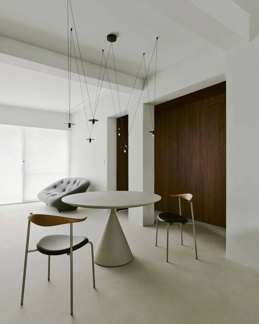
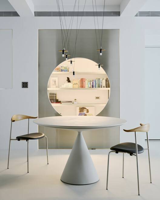
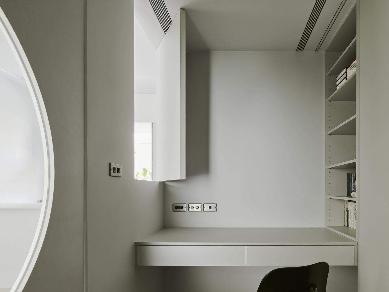
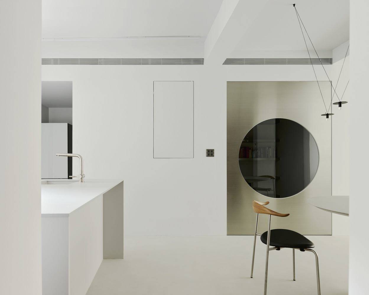
优雅有序-整个项目由简洁和优雅的深度组成。整体灰色背景设置了清晰明亮的色调,材料的纹理和颜色的使用突出了室内布局和结构特征。每个空间使用的饰面材料都有意略有不同,但都体现了一种简单的气质。餐厅的左右两侧分别对应卧室走廊和书房,两个区域通过不同的色调形成对比。这项研究是为业主保留的,是一个没有干扰的独立空间,房间里的一扇小窗户便于与家人交流。
Elegance in order - The whole project consists of simplicity and elegance in depth. The overall gray tone background sets a clear and light tone, and the use of the texture and color of materials highlights the interior layout and structural characteristics. The finish materials used in each space are intentionally slightly different, but all implement a simple temperament. The left and right sides of the dining room correspond to the bedroom corridor and the study room with the two areas in contrast through different tones. This study is reserved for the owner, an independent space without interference, and a small window in the room facilitates communication with the family.
© Studio Millspace
© Studio Millspace
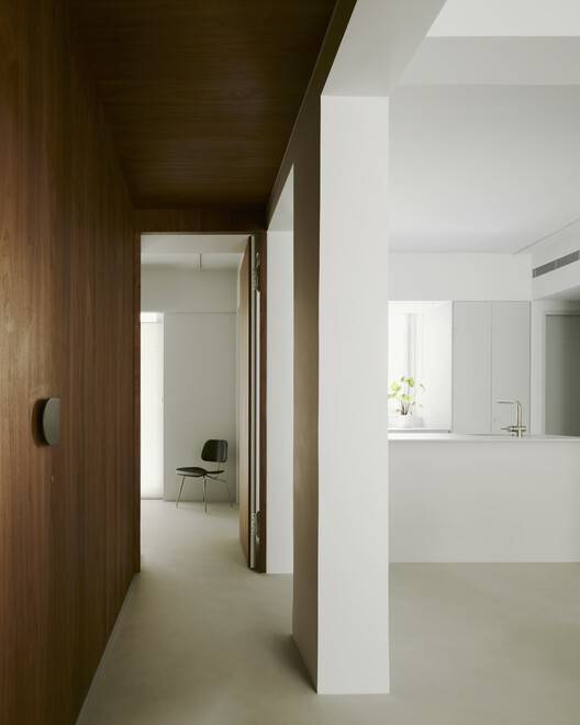
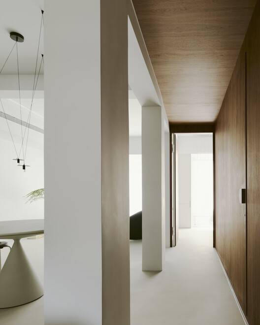
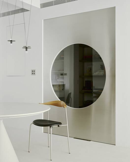
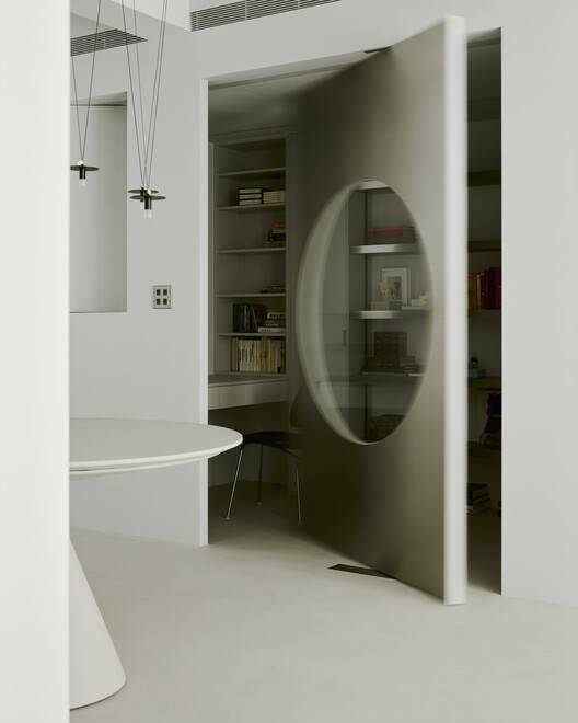
书房有一扇不锈钢旋转门,特意加宽,以适应回廊立柱的对称框架。,门上增加了一个圆形的月亮窗,以达到从房间内部向外延伸视线的效果。不锈钢饰面板有助于漫射光线,但保持内部空间的亮度。卧室走廊区域的天花板和立面采用胡桃木饰面,以减少空间的寒冷。我们故意将卧室和浴室的门藏在墙上,以暗示这个区域的私人属性。两间卧室位于走廊区域的左右两端,包括客用浴室空间。一致的暖色调立面与灰色空间形成对比,突出了空间结构的渗透性以及梁柱之间的关系。
The study room with a stainless steel finished revolving door, was deliberately widened to cope with the symmetrical frame of the cloister columns., A doorpiece was added with a round moon window to achieve the effect of extending the line of sight from the inside of the room out. The stainless steel finish panel helps diffuse the light but maintains the brightness of the interior space. The ceiling and elevation of the bedroom corridor area are finished with a walnut wood veneer to reduce the coldness of the space. We intentionally concealed the bedroom and bathroom doors in the wall to hint at the private attributes of this area. The two bedrooms are placed at the left and right ends of the corridor area to include the guest bath space. The consistent warm tone elevation contrasts with the gray space to highlight the permeability of the spatial structure and the relationship between beams and columns.
© Studio Millspace