楼下的商店/LAR+D
The Shop Downstairs / LAR+D
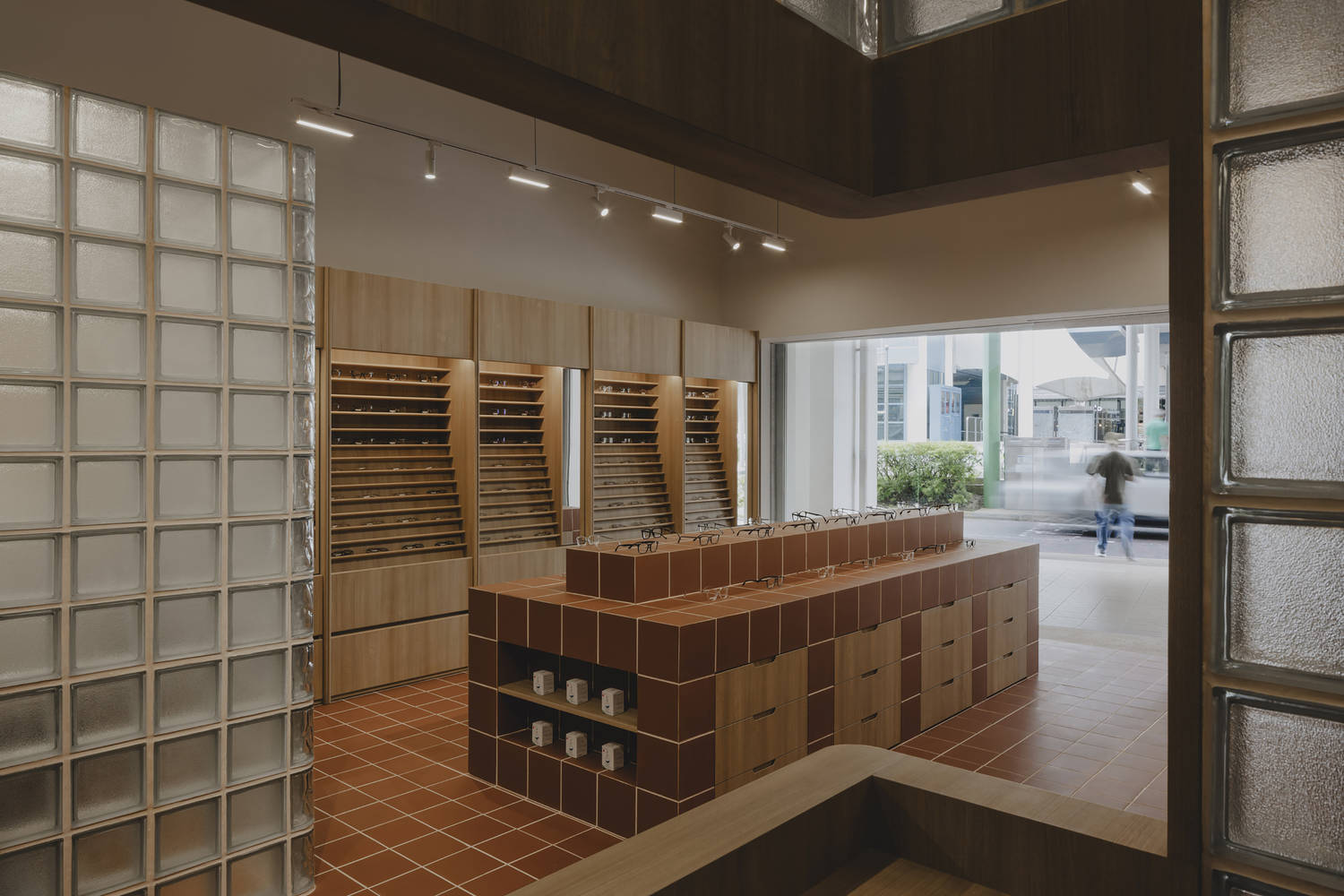
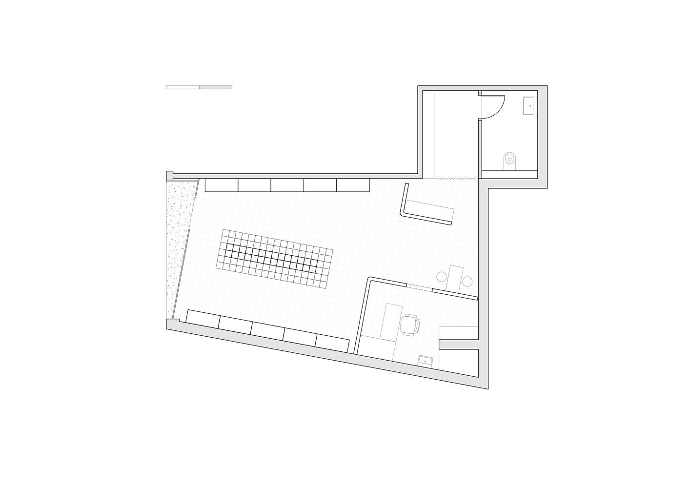
空间布局与氛围营造:楼下的商店设计独具匠心,入口倾斜与偏离中心的门厅吸引顾客。开放式布局促进活动无缝流动,打造轻松无障碍购物环境。模块化展示单元排列两侧,圆角边缘软化空间,玻璃块隔断区分私人区域且保持开放通风,整体平衡了倾斜布局,营造出和谐且具视觉吸引力的氛围。
材料运用与社区呼应:材料调色板与新加坡旧住宅区呼应,不仅作装饰还为功能元素。中心岛屿展示融入陶土瓷砖,构建展示与环境的视觉联系。熟悉材料的运用使商店紧密贴合社区,又以独特零售体验脱颖而出,实现实用设计与视觉吸引力的平衡。
施工策略与特色体现:面对施工时间紧迫,采用场外预制并快速组装模块化展示单元的策略。这些单元与圆角边缘等设计,有效应对倾斜布局挑战。玻璃块隔断的半透明特性,让光线穿透,在有限空间内保持轻盈与开放,彰显设计对功能与美学融合的精准把握。
© Studio Periphery
© Studio Periphery
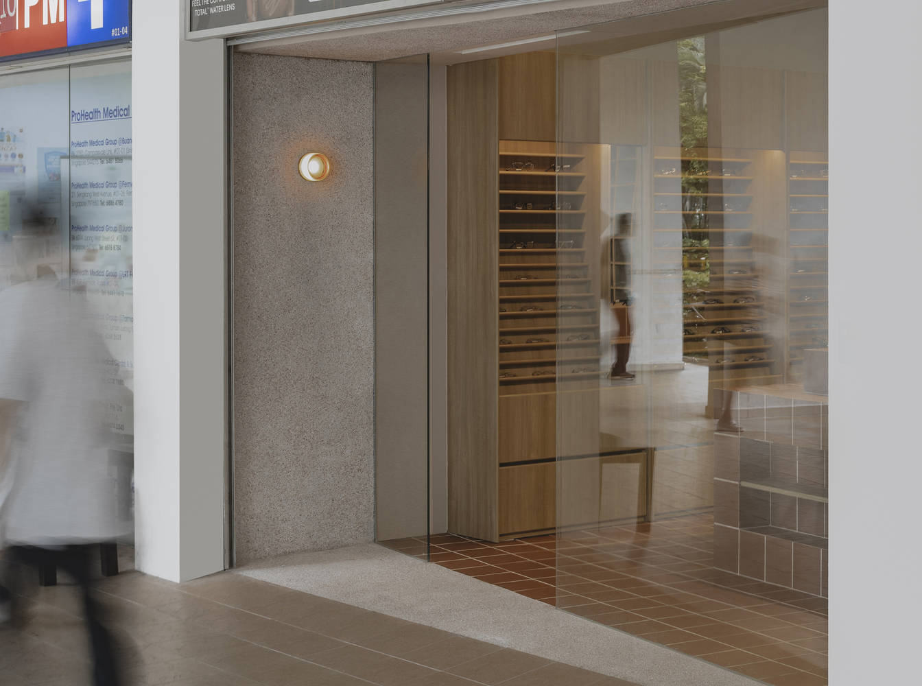
建筑师提供的文字描述The Shop Downstairs是一个俏皮而诙谐的例子,指的是为新加坡公共住房社区提供活力的重要商业中心。这家光学商店的入口悄悄地隐藏在一个迷人的街区的一排商店之间,故意倾斜,以一个热情的、偏离中心的门厅吸引顾客。该店的设计遵循开放式布局,促进了活动的无缝流动,创造了一个轻松无障碍的购物环境。
Text description provided by the architects. The Shop Downstairs is a playful and tongue-in-cheek reference to the essential commercial hubs that energize Singapore's public housing communities. Tucked quietly between a row of shops in a charming neighborhood, the optical store's entrance is intentionally skewed, drawing customers in with a welcoming, off-center foyer. The store's design follows an open-plan layout that fosters a seamless flow of activity, creating a relaxed and accessible shopping environment.
© Studio Periphery
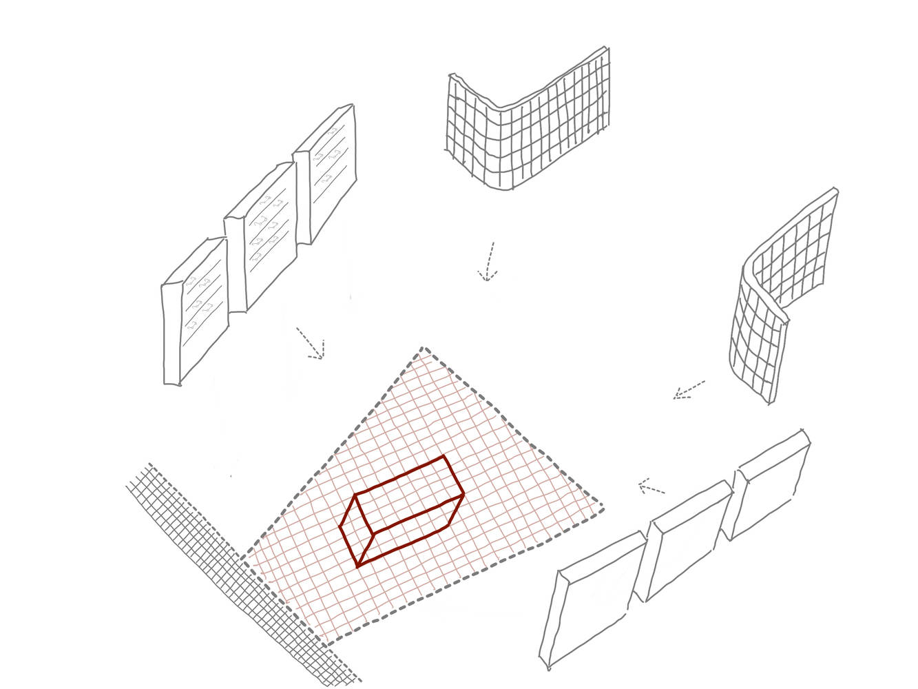
Diagram
© Studio Periphery
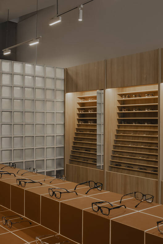
材料调色板与新加坡旧住宅区的纹理和色调相呼应,不仅用于装饰,还用作空间内的功能元素。值得注意的是,商店中心的岛屿展示被整合到地板的陶土瓷砖中,在展示和周围环境之间创造了一种有凝聚力的视觉联系。
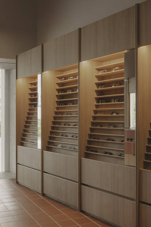
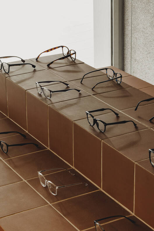
The material palette, which echoes the textures and tones of older Singaporean housing estates, is used not just for finishes but also as functional elements within the space. Notably, the island display at the center of the shop is integrated into the floor's terracotta tiles, creating a cohesive visual connection between the display and its surroundings.
© Studio Periphery
© Studio Periphery
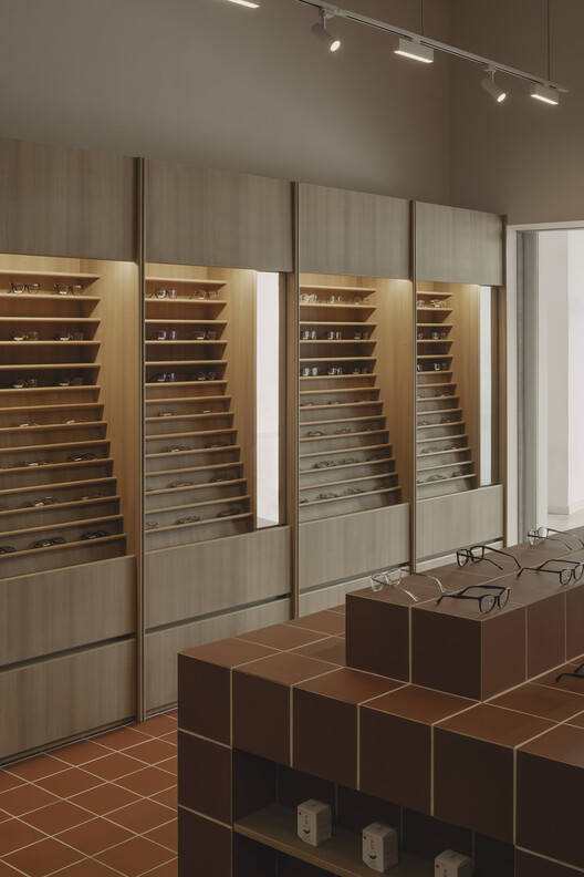
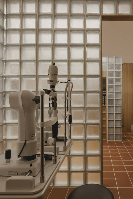
为了应对施工时间紧迫的挑战,一系列模块化展示单元被设计为在场外预制并快速组装。这些单元排列在商店的两侧,同时加入了圆角边缘,以软化空间中原本尖锐、正交的特征。这种设计选择有助于平衡商店的倾斜布局,确保和谐和视觉吸引力的氛围。玻璃块隔断通过为私人区域创造微妙的分隔,进一步增强了空间,同时保持了一种开放、通风的感觉。半透明的隔断允许光线透过,尽管商店相对较小,但仍然保持了它的轻盈和开放。
To address the challenges of a tight construction timeline, a series of modular display units were designed to be prefabricated off-site and assembled quickly. These units line both sides of the store, while rounded edges were incorporated to soften the otherwise sharp, orthogonal character of the space. This design choice helps balance the shop's skewed layout, ensuring a harmonious and visually engaging atmosphere. Glass block partitions further enhance the space by creating subtle separations for private areas, while maintaining an open, airy feel throughout. The translucent partitions allow light to filter through, preserving the shop's lightness and openness, despite its relatively small size.
© Studio Periphery
Plan
将功能元素与感性美学相结合,实现了实用设计和视觉吸引力之间的平衡。使用熟悉的材料可以使空间与周围的社区紧密结合,但作为一种独特的零售体验脱颖而出。
Blending functional elements with a sensible aesthetic results in a balance between practical design and visual appeal. The use of familiar materials allows the space to be cohesive with its surrounding community but stands out as a unique retail experience.
© Studio Periphery