Taichung Li Mansion/InOrder Studio
台中李宅 / InOrder Studio
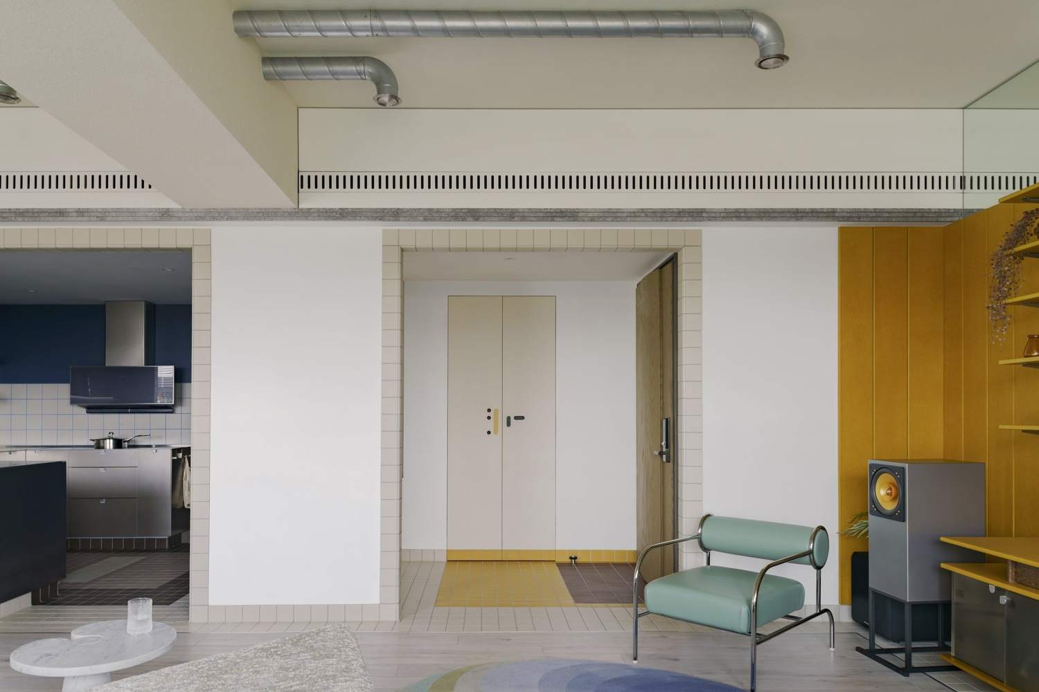
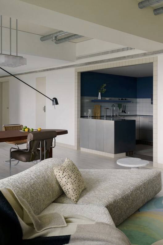
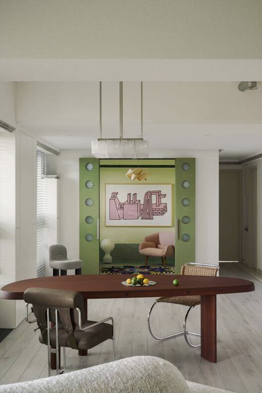
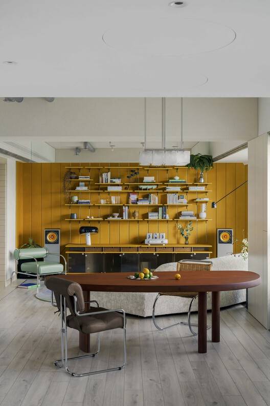
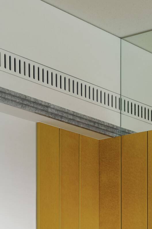
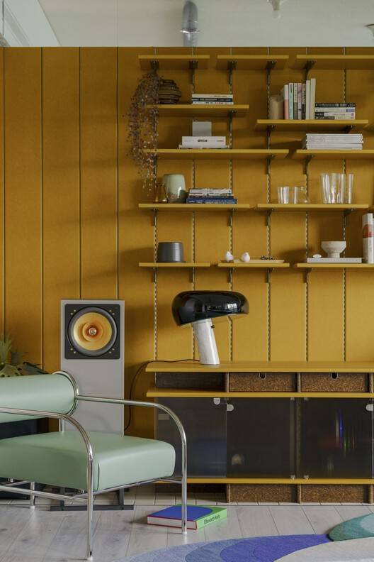
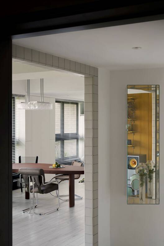
空间与家具的和谐统一: 李宅项目最引人注目的特点在于其对家具与空间关系的精准把握。考虑到业主对20世纪50年代后现代主义家具的热爱,设计师巧妙地将空间作为展示家具的舞台,并以“宁静、不张扬”的背景衬托。这种策略并非简单地堆砌家具,而是深入研究家具的色彩、形态,进而决定空间的色彩基调、材质选择和细节处理。例如,定制的空调出风口、精心挑选的门把手等细节,都服务于凸显家具的艺术价值。这种以家具为核心的设计理念,体现了设计师对空间与陈设的整体思考,使得居住空间既充满个性,又和谐统一。
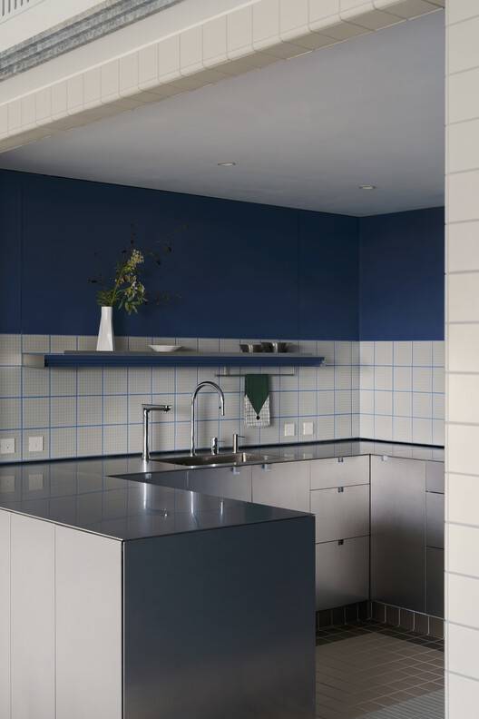
色彩与功能的巧妙融合: 项目在色彩运用上的精妙之处值得称赞。设计师并未盲目堆砌色彩,而是将黄色、蓝色、绿色作为主要点缀色,精准地服务于空间的功能划分。这些色彩被巧妙地应用于客厅、厨房和书房等不同区域,从而清晰地界定了空间的功能,并提升了空间的视觉层次感。此外,设计师还将色彩方案融入到空间框架、家具形式和布局策略中,营造出一种整体的和谐与平衡。这种对色彩的深度理解和细致运用,不仅美化了空间,更赋予了空间情感和活力,使之成为一个令人放松、充满乐趣的居住环境,真正实现了为高压生活提供“绿洲”的设计目标。
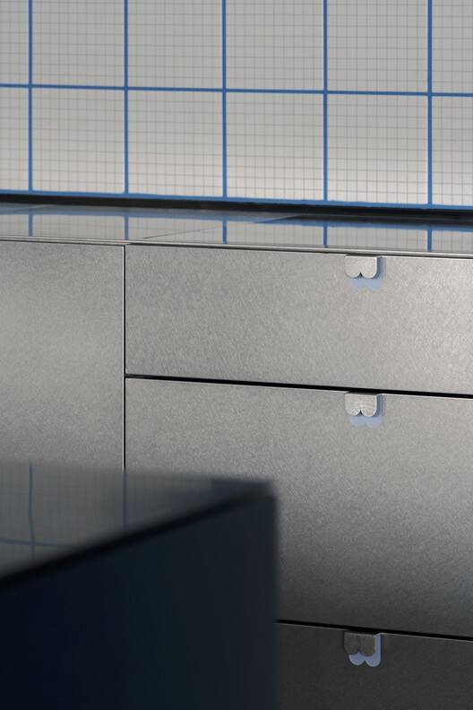
材料与工艺的精湛运用: 李宅项目在材料选择和工艺细节上的精益求精,是其成功的关键因素之一。设计师充分利用每种材料的特性和表现潜力,例如,厨房的不锈钢折叠式台面、防污瓷砖以及桦木胶合板床头板,都体现了设计师对材料的深刻理解和对工艺的极致追求。这些精心挑选的材料与精准的工艺,共同构建了一个精致、舒适的空间。这种设计理念也契合了“将合适的东西放在合适的地方”的精髓,充分展现了设计师对设计细节的严格把控。项目展现了设计不仅仅是视觉的呈现,更是一种生活方式的体现,以及对居住者生活品质的深刻关怀。
© studio vwp
© studio vwp
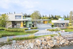
Li's residence is located in Taichung City, covering an area of 45 ping (approximately 148.5 square meters). The owner is a couple who love postmodern design from the 1950s and have a deep understanding of furniture. Given their high-pressure professional lives, they seek a vibrant and colorful home - an oasis that can rejuvenate their physical and mental energy.
李宅位于台中市,占地面积 45 坪(约 148.5 平方米)。业主是一对热爱 20 世纪 50 年代后现代主义设计并对家具十分了解的夫妇。鉴于他们高压的职业生活,他们寻求一处充满活力、色彩缤纷的居所——一个能够焕发身心活力的绿洲。
© studio vwp
A significant portion of this space is used to showcase the beloved furniture of the homeowners. Due to the rich and diverse colors of the furniture, the planning was very cautious, maintaining a "peaceful and understated" background. Therefore, many details in the entire space have been carefully crafted: customized air conditioning vent panels, carefully selected door handles, hidden switches, and precisely aligned tile joints, all highlighting the wonderful interaction between the interior and furniture.
该空间有很大一部分用于展示屋主们心爱的家具。由于家具色彩丰富多样,规划时非常谨慎,保持了一个“宁静、不张扬”的背景。因此,整个空间中的许多细节都经过精心打造:定制的空调出风口面板、精心挑选的门把手、隐藏式开关以及精确对齐的瓷砖拼接,都凸显了室内与家具之间美妙的互动。
© studio vwp
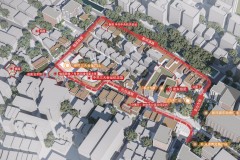
平面图
© studio vwp
© studio vwp
In order to coordinate with the homeowner's main furniture, yellow, blue, and green were chosen as the main accent colors. These colors help define areas such as the living room, kitchen, and study. At the same time, the color scheme and design details are carefully layered in the spatial framework, furniture form, and layout strategy, creating a sense of overall harmony and balance.
为了与屋主的主要家具相协调,选择了黄色、蓝色和绿色作为主要的点缀色。这些颜色有助于界定客厅、厨房和书房等区域。同时,色彩方案和设计细节在空间框架、家具形式和布局策略中经过深思熟虑的层叠,营造出一种整体的和谐与平衡感。
© studio vwp
© studio vwp
The selection of materials aims to utilize the unique characteristics and expressive potential of each element: the stainless steel folding countertop, anti fouling tiles, and birch plywood headboard in the kitchen all demonstrate that in this project, design is truly an art of 'putting the right thing in the right place'.
材料的选择旨在利用每个元素的独特特性和表现潜力:厨房中的不锈钢折叠式台面、防污瓷砖以及桦木胶合板床头板,都展示了在这个项目中,设计真正是一门“将合适的东西放在合适的地方”的艺术。
© studio vwp