Writing Desk Changsha Concept Store Design/Introduction Studio
写字台长沙概念店设计 / 介介工作室
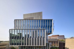
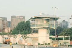
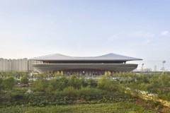
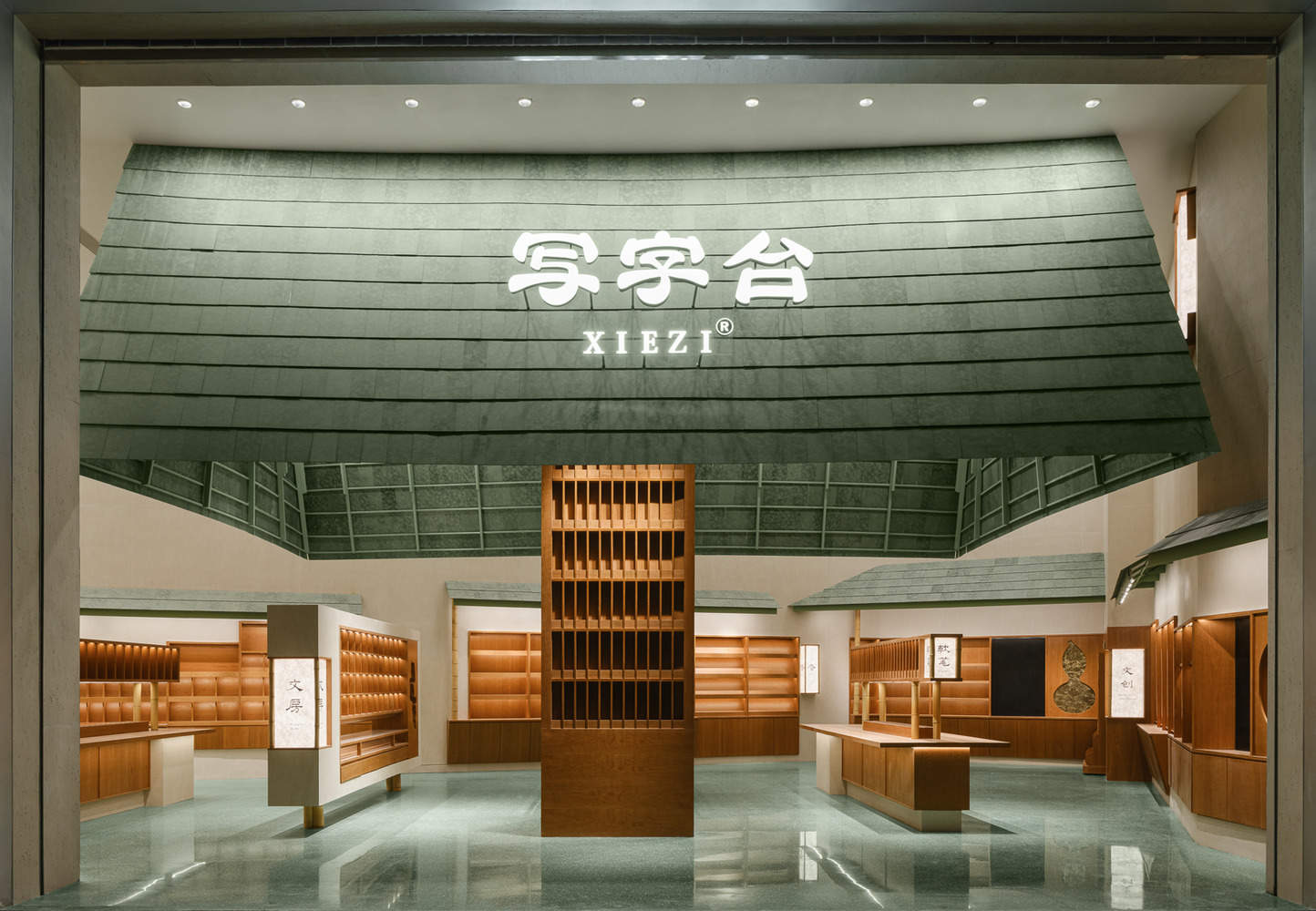
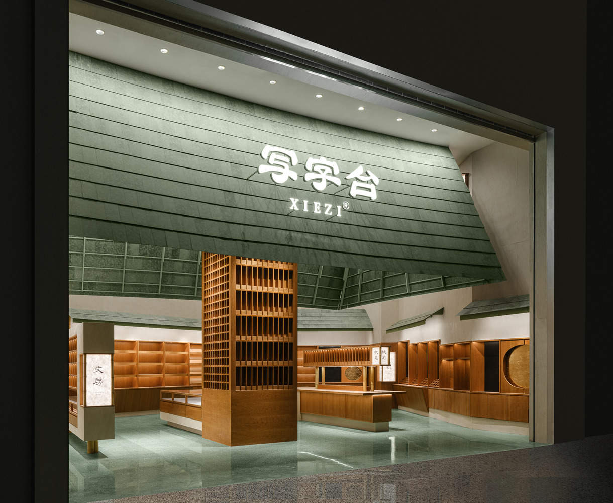
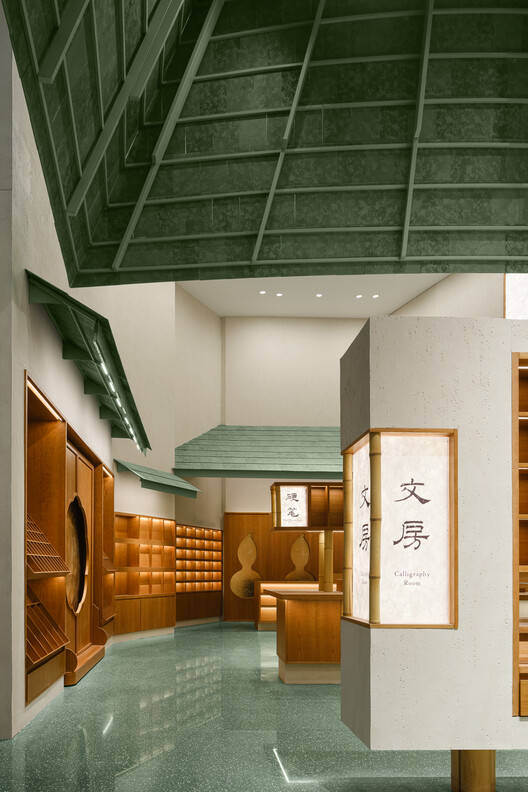
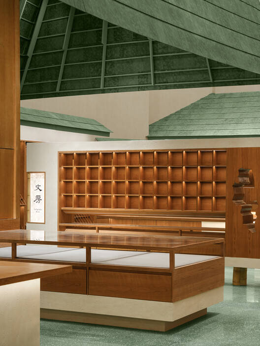
整体概念与视觉冲击:该项目最引人注目的亮点在于其极具辨识度的外观设计。巨大的绿色屋顶,由单一的巨柱支撑,营造出一种强烈的视觉冲击力,宛如一座现代化的华盖。这种设计手法打破了传统商业空间的束缚,大胆采用了超尺度的元素,使其在众多店铺中脱颖而出。门头的整体设计,从高度到宽度,都达到了一个令人印象深刻的体量,绿色鎏金瓦的应用更是赋予了建筑独特的东方韵味,极具文化内涵。这种设计不仅吸引了顾客的目光,更传递了一种品牌调性与文化自信。
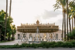
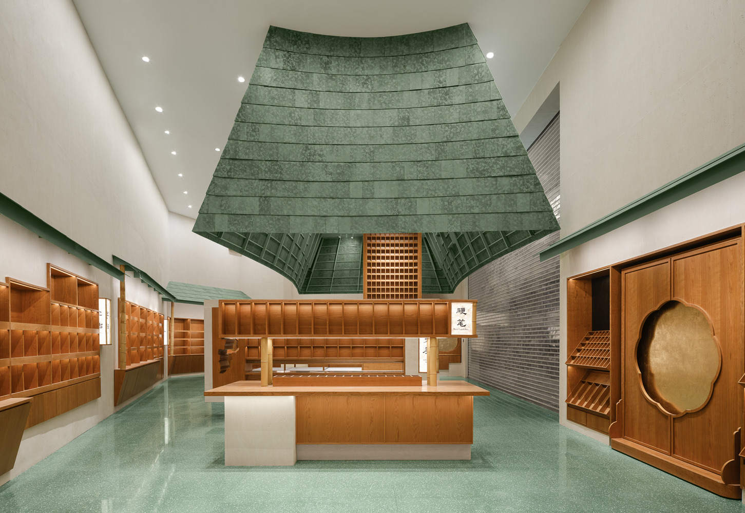
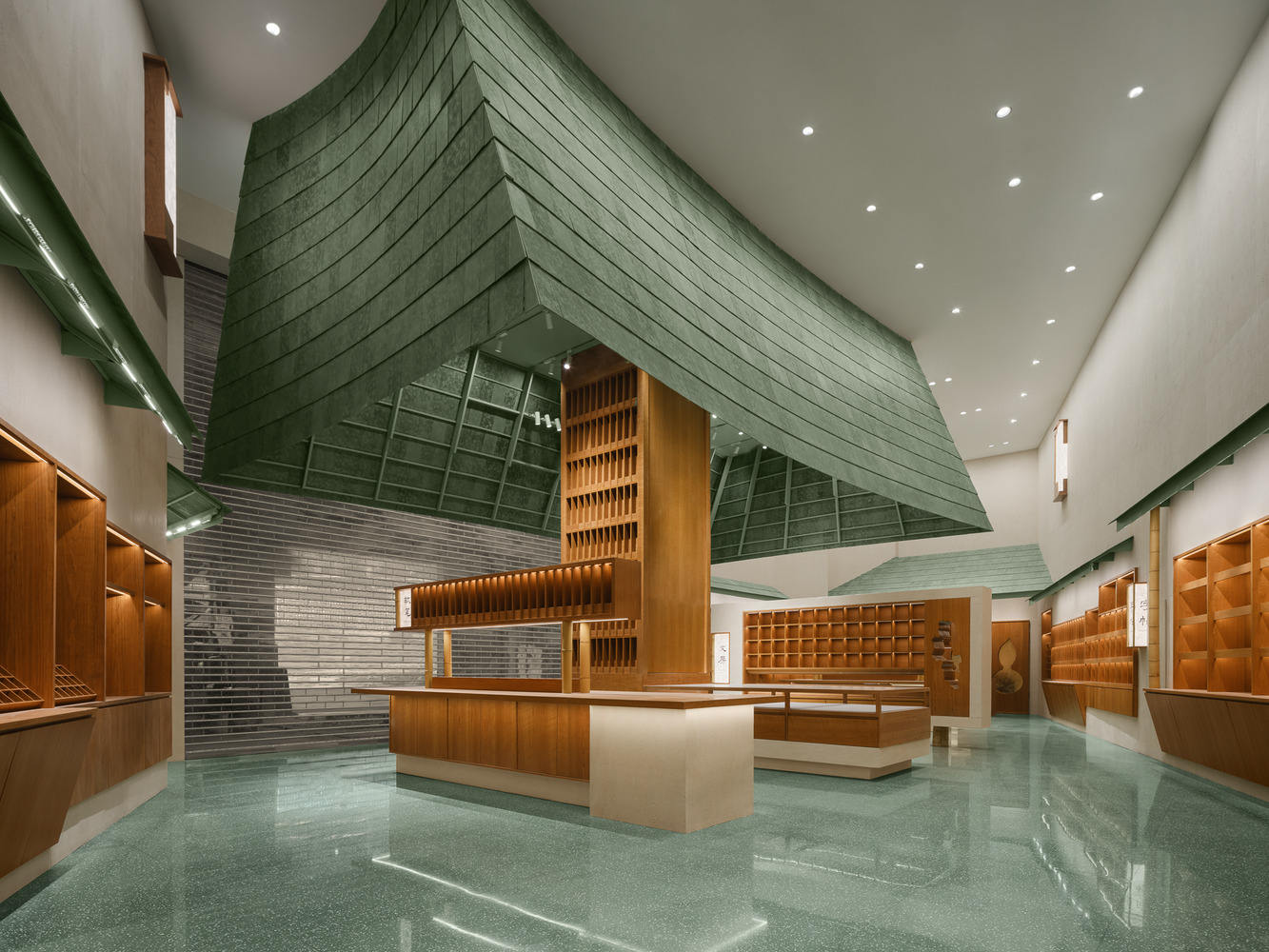
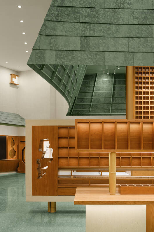
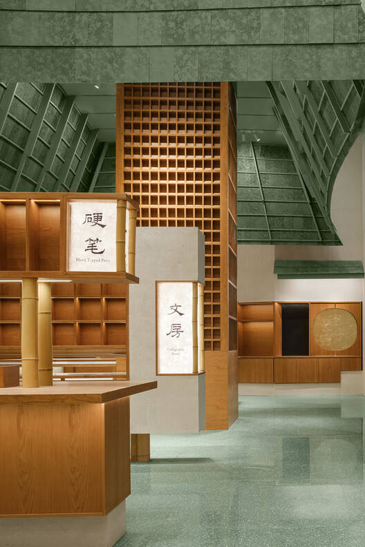
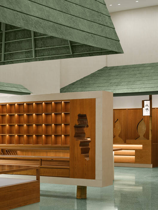
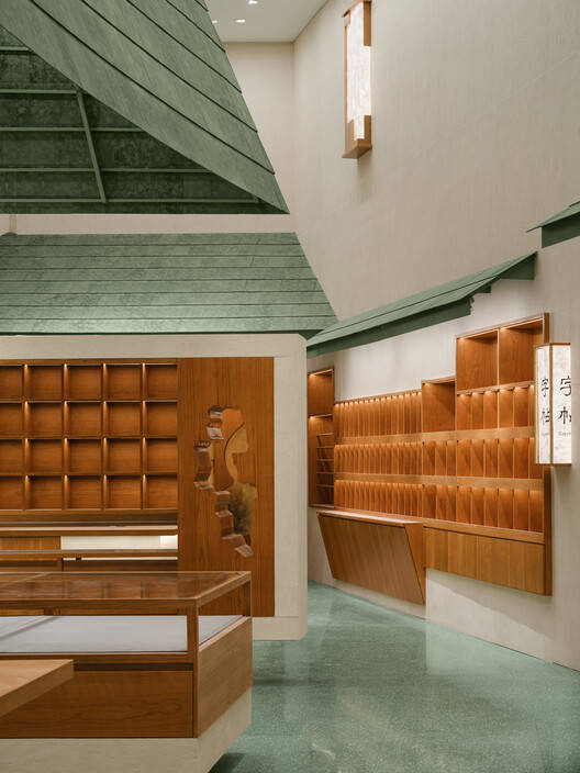
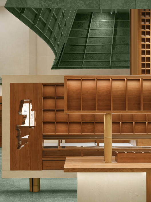
空间布局与展示策略:项目在空间布局上巧妙地运用了抽象与具象相结合的设计手法。抽象的“像素”柜体展示单元,将产品以网格化的方式呈现,如同中国传统书房中的元素被解构重组,最终形成一幅富有东方韵味的“像素画”。这种展示方式既强调了产品的多样性,又赋予了空间一种秩序感与艺术感。与此同时,项目也融入了具象的元素,如葫芦形、团扇形、太湖石形的展示台,这些传统意象的运用,进一步深化了项目的文化内涵,使得整个空间更具吸引力。
材料运用与细节处理:在材料的选择上,该项目着重体现了对绿色和传统文化的尊重。绿色水墨纹样的鎏金板、绿色水磨石地面、仿洞石的软性石材以及樱桃木纹板材等,共同营造出一种和谐统一的视觉效果。特别值得一提的是,项目精心设计的“宫灯”导视系统,巧妙地穿梭于整个空间,为顾客提供了清晰的导向,同时也在视觉上增添了一抹亮色,丰富了空间的层次感。这些细节的处理,体现了设计师对整体风格的精准把握和对传统文化精髓的深刻理解。
© 陈鹏蓬
© 陈鹏蓬
In this project, a huge green roof is supported by a massive pillar, resembling a canopy that almost everyone cannot ignore.
在这个项目中,一个巨大的的绿色的屋顶由一根巨大的的柱子撑起,看起来像一个华盖一般,几乎所有的人都无法忽视这个特别而巨大的门头。
© 陈鹏蓬
© 陈鹏蓬
整个门头的高度达到了5.7米高8.7米宽,绿色的鎏金瓦铺满整个门头的上部,几乎占了整个门面的二分之一。
© 陈鹏蓬
© 陈鹏蓬
Abstract Facade and Concrete Content:Facade and Display Cabinet Design
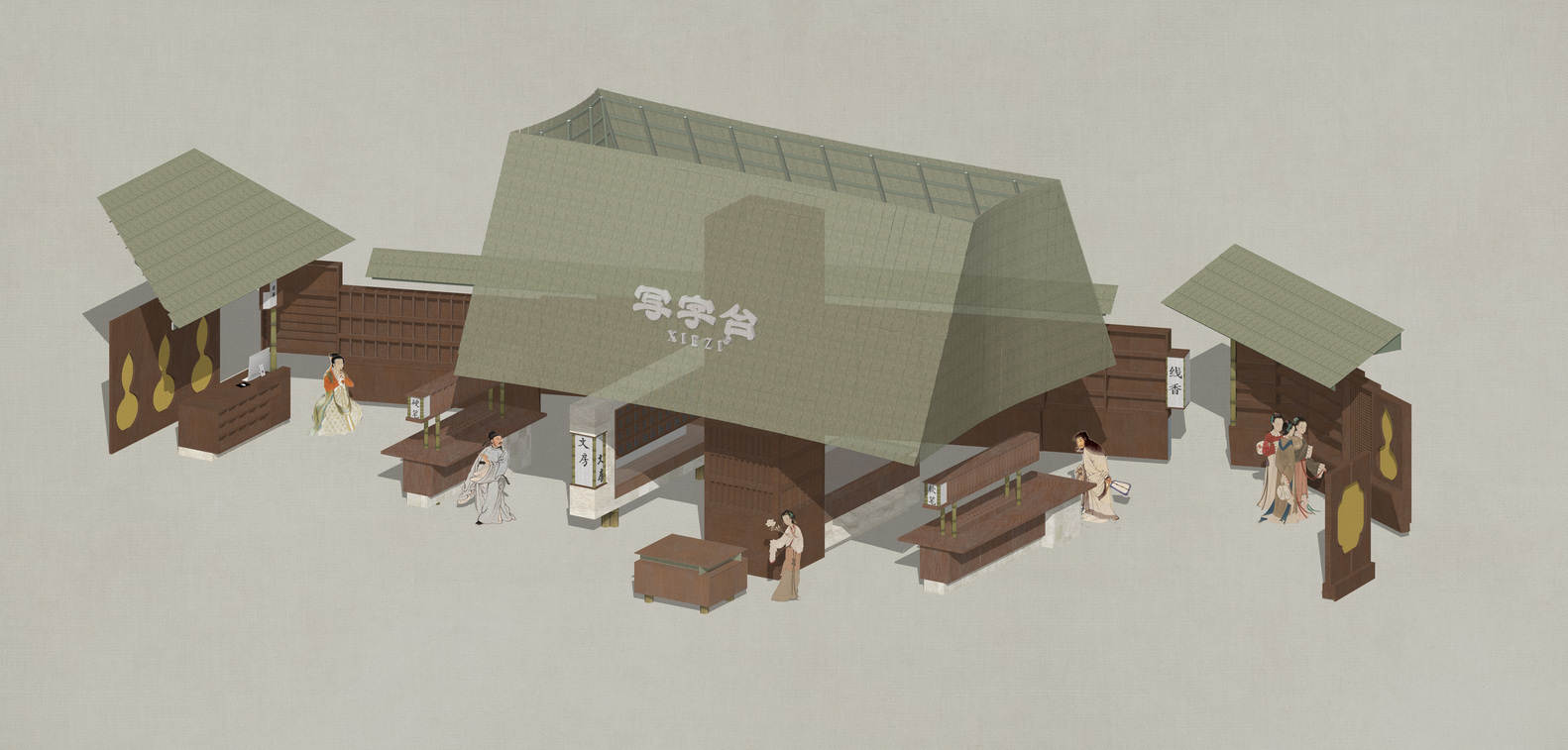
Writing desk brands have their own very complete product logic, which includes cultural and creative, soft pen, hard pen, stationery, calligraphy, and so on, covering almost every aspect of Chinese study rooms.. What we need to do is to distinguish their specific size, texture, and the most appropriate display method, and then place them in an appropriate location. These grids are the smallest display units. They are like "pixels" that ultimately form a picture with a Chinese flavor.
抽象的立面与具体的内容:立面与展柜设计
写字台品牌有自己非常完整的产品逻辑,其中包含文创、软笔、硬笔、文房、字帖等等,几乎涵盖了中式书房里的方方面面。我们所要做的是区分出他们的具体尺寸、质地、和最恰当的展示方式,然后放到一个恰当的位置。这些格子是最小的展陈单元。他们像一个个“像素”最终构成了一幅有中式意味的画面。
© 陈鹏蓬
© 陈鹏蓬
A more concrete image
If the green gilt plate roof, white wall, and wooden pixel cabinets form a more abstract picture with Chinese intentions, then the specific gourd shaped, round fan shaped, and the Taihu Lake stone shaped shops are closer to the traditional direction. The Taihu Lake Lake Stone has become a visual gateway, with gold foil pasted on it in the form of a round fan, becoming an exhibition stall for refrigerator stickers.
更加具象的形象
如果说绿色鎏金板顶、白墙、木色像素的柜子,组成了一幅比较抽象的带有中式意向的画面的话,那么,具体的葫芦形、团扇形、太湖石形,则使得整个店铺更加往传统的方向上靠的更加紧密了。太湖石成为了一个视觉通口,团扇形贴上金箔,成为冰箱贴的展卖档口。
© 陈鹏蓬
© 陈鹏蓬
And we have specially designed a series of "palace lanterns" for the entire store's navigation system. They are either embedded in walls, mounted on frames, or suspended between columns. High and low, varying in size, embellish a lively literary market. Guide customers to find what they want to buy as quickly as possible. In terms of material selection, we mainly use green as the main color tone. The green ink patterned gilded board serves as the main material for the top and eaves. The ground is made of green terrazzo blocks. And the wall is made of soft stone that imitates cave stones. The cabinet is made of cherry wood grain board, glass, acrylic light box, and bamboo.
而整个店铺的导视系统我们专门设计了一些列的“宫灯”造型。他们或嵌入墙体,或至于架上,或悬与柱间。高高低低,大小不一,点缀出一个热闹的文房市集。引导让顾客能以最快的速度找到他想买的东西。在材料的选择上,我们以绿色为主色调。绿色水墨纹样的鎏金板作为顶部,檐口的主材料。地面选用了绿色水磨石块材。而墙面则是选择仿洞石的软性石材。柜体是樱桃木纹板材,玻璃,亚克力灯箱,竹子。
© 陈鹏蓬
© 陈鹏蓬