Torriden旗舰店/YGGGR
Torriden Flagship Store / YGGGR
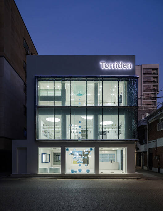
空间语言的诗意表达:这个项目的核心亮点在于其对品牌理念的深度诠释和视觉转化。设计师YGGGR巧妙地运用了波浪形的玻璃外立面,营造出“水面行走”的视觉错觉,这不仅是一种建筑美学,更是对Torriden品牌“水合、纯净、清晰”核心价值的直观表达。自然光线的折射和漫射,进一步强化了这种“水”的意象,使整个空间充满流动感和通透感。这种设计策略不仅满足了功能需求,更重要的是,它成功地创造了一种沉浸式的感官体验,使顾客在进入店铺的瞬间就能感受到品牌的精髓。
光影与材质的和谐互动:项目的精髓在于对光线、材质和空间关系的精妙把握。设计师通过玻璃的运用,让自然光线在空间中形成柔和的涟漪,营造出一种轻盈、流动且充满生命力的氛围。透明货架的巧妙设计,使产品仿佛悬浮在空中,进一步强化了水的意象,提升了感官体验的层次。这种设计手法不仅仅是装饰性的,更是对品牌内在价值的诗意表达。整个空间如同一个流动的舞台,光影的变化、材质的质感、以及产品的陈列,都构成了一场精妙的视觉盛宴,吸引着顾客的目光,同时也传递着品牌的独特魅力。
沉浸式体验与品牌故事的完美融合:该项目最引人入胜之处在于其对沉浸式体验的极致追求。设计师将建筑的每个元素都融入到品牌的叙事中,从外观到内部陈设,每一个细节都精心设计,旨在创造一种无缝的、沉浸式的体验。这种体验不仅仅停留在视觉层面,还包含了触觉、嗅觉等多种感官。整个空间犹如一个品牌故事的载体,顾客在其中漫步,如同进入一个充满水分的梦境,每一个动作、每一次触碰,都成为与品牌进行情感连接的瞬间。这种设计手法将商业空间转化为一个具有诗意和情感的舞台,赋予了品牌更深层次的内涵和价值。
© Yong Joon Choi
© Yong Joon Choi
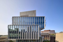
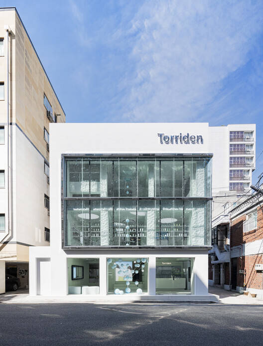
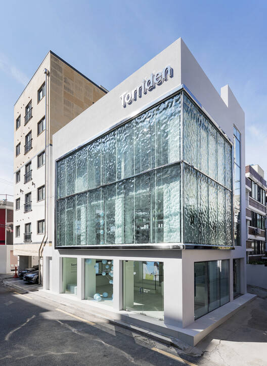
建筑师提供的文字描述。在城苏洞的中心,有一个空间感觉就像一个在城市中盛开的小海洋。Torriden在成苏的旗舰店宁静而清澈,宛如一滴水,以最纯粹的形式表达了该品牌的精髓。
Text description provided by the architects. In the heart of Seongsu-dong, there is a space that feels like a small ocean blooming within the city. Torriden's flagship store in Seongsu is serene and crystal-clear—like a single drop of water—expressing the very essence of the brand in its purest form.
© Yong Joon Choi
© Yong Joon Choi
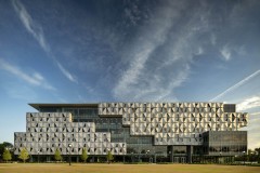
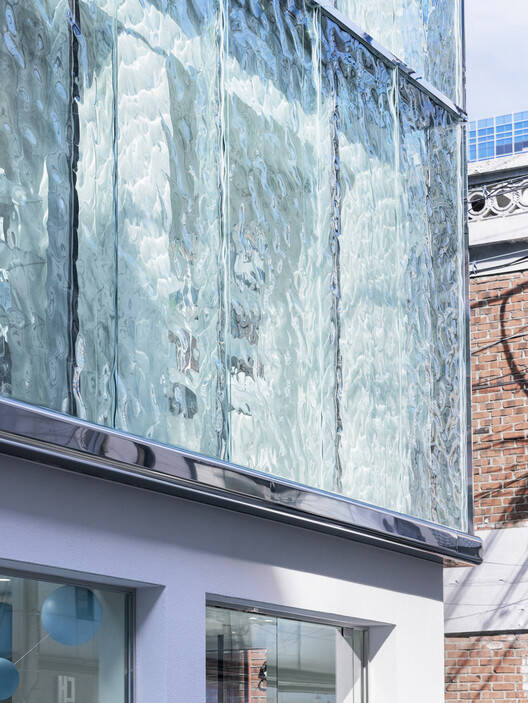
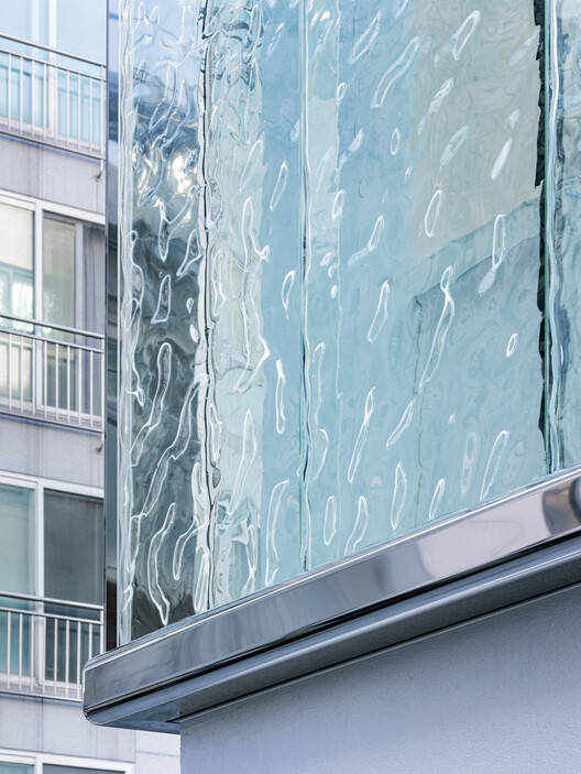
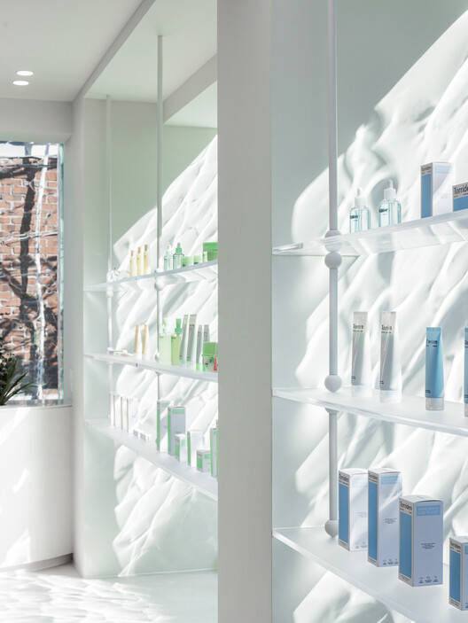
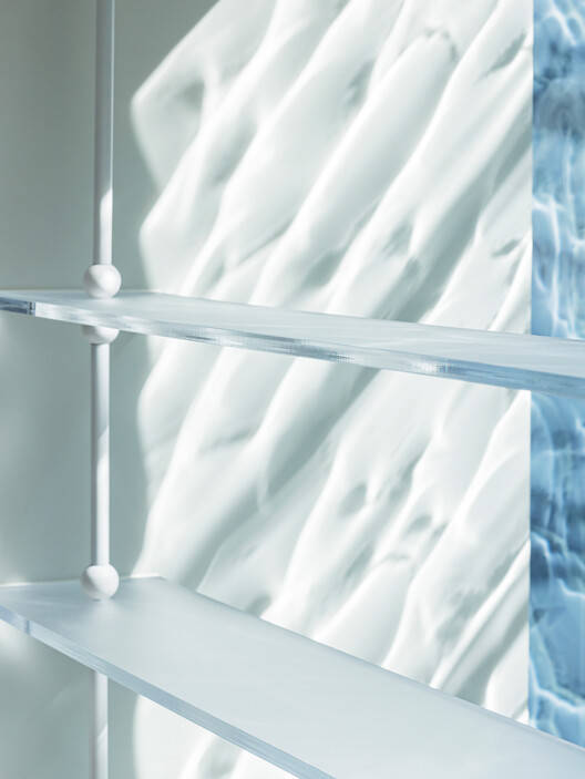
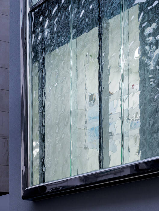
它的外观被波浪形的玻璃包裹着,给人一种在水面上行走的错觉。自然光透过玻璃,轻轻折射到空间中,在墙壁、地板和架子上洒下柔和的涟漪。这不仅仅是建筑装饰,也是托里登核心价值观的视觉翻译:水合、纯净和清晰。
Its exterior is wrapped in undulating glass that evokes the illusion of walking on the surface of water. Natural light filters through the glass, refracting gently into the space and casting soft ripples across walls, floors, and shelves. This is not just architectural ornamentation—it is a visual translation of Torriden's core values: hydration, purity, and clarity.
© Yong Joon Choi
© Yong Joon Choi
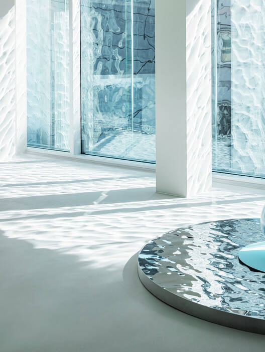
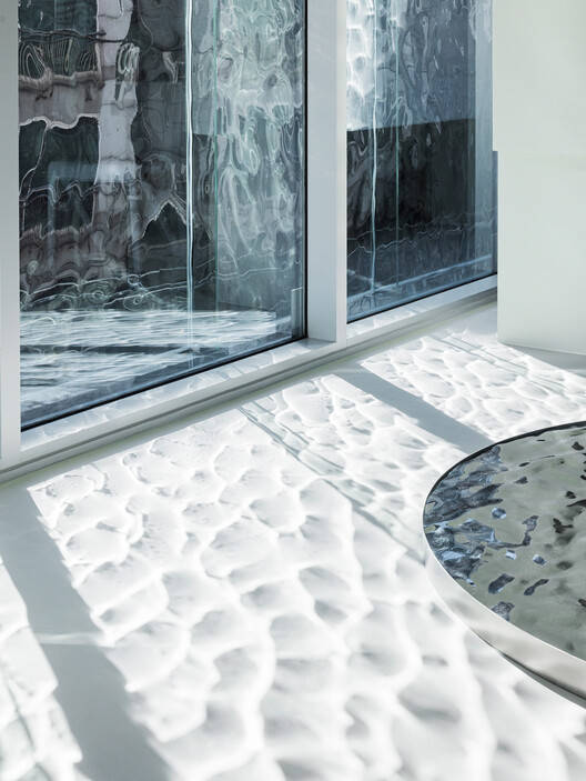
踏入其中,你会被一个柔软、流畅的氛围所包围——几乎就像在水中游泳。光线和阴影的相互作用,通过玻璃折射,像流动的波浪一样在整个空间中闪闪发光。每种产品都陈列在透明的货架上,看起来像水滴一样漂浮在半空中,增强了感官体验。
Step inside, and you're surrounded by a soft, fluid atmosphere—almost as if swimming through water. The interplay of light and shadows, refracted through glass, shimmers throughout the space like flowing waves. Each product, displayed on transparent shelves, appears to float mid-air like droplets, enhancing the sensory experience.
© Yong Joon Choi
这是一个战略性的设计选择,旨在清晰地传达品牌的信息。在首尔——一个感官驱动品牌聚集的标志性街区——Torriden需要一种独特的视觉语言来立即吸引人们的注意力。这个空间不仅是一个展示产品的地方,也是品牌世界观和故事的具体体现。
This is a strategic design choice, crafted to clearly convey the brand's message. In Seongsu—an iconic neighborhood where sensory-driven brands gather—Torriden needed a unique visual language to immediately captivate attention. This space is not merely a place to showcase products, but a tangible realization of the brand's worldview and storytelling.
© Yong Joon Choi
商店的每个元素都经过精心设计。从你迈出一步、伸手去拿一件产品,或者只是凝视着不断变化的光线的那一刻起,每一个手势都成为了沉浸式体验的一部分——在富含水分的氛围中毫不费力地流动。
Every element of the store has been thoughtfully designed. From the moment you take a step, reach for a product, or simply gaze at the shifting light, every gesture becomes part of an immersive experience—one that flows effortlessly within a moisture-rich atmosphere.
© Yong Joon Choi
© Yong Joon Choi
这样,YGGGR设计的成苏旗舰店不仅是一个体现Torriden哲学的空间,也是一个感官体验的诗意舞台。正是建筑以大自然的声音说话,在城市的中心提供了一种温柔而感性的信息。
In this way, the Seongsu flagship store designed by YGGGR is not only a space that embodies Torriden's philosophy, but also a poetic stage for sensory experiences. It is architecture that speaks in nature's voice, offering a gentle and emotional message within the heart of the city.
© Yong Joon Choi